
Tags
How is HIV affecting the United States?
By Choco Chan and Sharon Tang
As HIV (human immunodeficiency virus) hits the top of the chart for being one of the most life-threatening diseases in the world, here’s what you should know about the mechanism working behind this killer:

The sources online are in general very open, including the United States’ Center for Diseases Control and Prevention, Britain’s Public Health and Hong Kong’s Census and Statistics Department. Out of all the top countries with people suffering from HIV, the United States is one of them. With its huge population and severity, data from their official reports were derived and put into charts and infographics in order to enhance a relatively elaborate visualization.
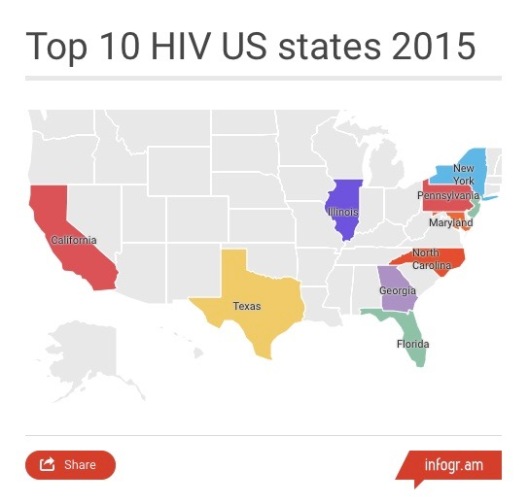
The existence of HIV diagnoses are everywhere in America, with Florida, California and Texas being the three most popular states. In particular, all of the top ten states with the most HIV cases are clustered in the Southeastern region of the United States. The larger the state is, the higher the likelihood it is to get more of its diagnosis.
According to the CDC, the heavy burden of HIV in the South is driven in part by unique socioeconomic factors, such as income inequality and poverty.
The Southern region in the United States accounts for 44% of HIV cases in total among its population. And the tragedy behind this epidemic is that African Americans population are severely affected by this disease. It may be because of a lack education and common ground of safety precautions for sexual intercourse, etc.
As we are heading to the end of 2016, let’s review the data collected last year first before we make any comparisons and analysis.
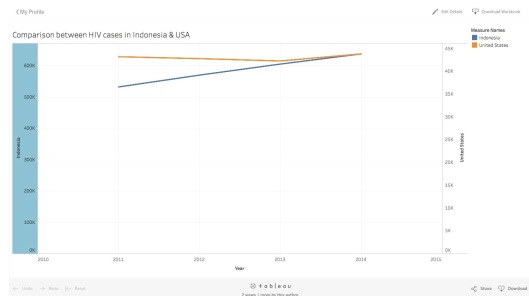
Below is a graph to show the steady increments of HIV prognoses of two vastly different countries: United States of America and Indonesia. The two countries were chosen due to a very similar population size. The interactive graph indicates starting from the year 2011, Indonesia had 532,694 new HIV diagnoses. The year after, Indonesia had 570,599 new diagnoses, a 37,905 increase in new cases. The following year, Indonesia once again increased to 605,884, which is a 35,245 increase. And in 2014, Indonesia yet again with an additional 43,889 HIV cases. The data shows that the number of new HIV cases in Indonesia has been steadily expanding, from 37,905 in the year 2012 itself, to 43,899 new cases in 2014. Meanwhile, as data suggests, the United States of America from 2011 to 2014, has had a steady number of new cases of HIV diagnoses that hover around the 43,000 cases mark. Although with limited data, the graph does suggest that Indonesia’s new number of cases will continue to climb, while United States has plateaued due to numerous variables, which we will dwell on below.
The epidemic of HIV infection increased rapidly throughout the 1980s, peaked around in the mid 90s, and then gradually declined. The number of people aged 13 or above living with AIDS went from 323 in 1981 all the way up to 78954 in 1993. As more cases were reported, there was a significant increase in the number of deaths too. In 1981, 122 patients died out of the 323 cases reported; while during the peak year 1993, 45187 deaths were reported, which is more than 57% of the total cases that year. The CDC also associated the peak of new diagnoses with the expansion of the AIDS surveillance case definition in 1993.

Yet, with the introduction of the highly active antiretroviral therapy in the mid 1990s, the number of new AIDS cases and deaths declined drastically. Of the 24855 cases by the end of 2001, only 8998 patients had deceased.
On average there are 68000 new cases a year from 2010 to 2014. And within each year, male to male sexual contact has been the predominant factor for HIV transmission, with 27000 cases diagnosed per annum. This is followed by male to female sexual contact and intravenous drug use.
See interactive visualisation of diagnoses of HIV infection by transmission category:

Among all the cases reported, African-Americans/Blacks in the United States are the most affected population. In 2010, for example, out of 44940 diagnosed HIV cases, almost half happened among the Blacks, followed by the Whites, and then the Hispanic group. Up till now in 2016, African-Americans account for only 13% of the population but 43% of new HIV infection.
Although the United States of America is broadcasted as the “land of the free and the home of the brave”, the amount of freedom experienced between the different racial and socioeconomic groups are vastly different, as shown in the National Center for Education Statistics and a recent Pew Research Center survey. This deep divide between the African Americans and the Whites is particularly pronounce in the Southern part of the States. As such, African Americans have a disadvantage in these regions and thus results in receiving disproportionate amount of care and education to prevent or treat the disease itself.
See more of the infographic as you click into the infographic play with it:

With ongoing researches on this disease, along with recent technological advancements in the science community, we as humans are working around the clock on finding better treatments in hopes of finding the ultimate cure in the not so distant future. What we can do however, is to provide better education and support for groups who may be more susceptible in succumbing to the disease. Prevention is the ultimate eradication.
