Time: Nov. 2, 2018 (Fri.), 11:00 a.m.-12:20 p.m.
Venue: CVA 506, HKBU
Speaker: Andy Shu
Language: English


24 Wednesday Oct 2018
Posted in Announcement, Announcements, general, news story, Open Lecture, Tool
07 Thursday Jun 2018
At this year’s GEN (Global Editors Network) summit, Google News Initiative shared their notes regarding data journalism resources, particularly for investigative research and verification by online forensics. Here are some excerpts and we get a copy from Google News Lab, which you may find the complete notes attached at the end.
Find more on data journalism training and multimedia toolsets below:
14 Wednesday Feb 2018
Tags
農曆新年伊始,小編在此給各位愛學習的小夥伴推薦一些學習Data Journalism有用的線上課程,資料和工具。希望新的一年,大家學業進步!順順利利!(原文部分轉載自 initiumlab.com, 有部分編輯, 點擊查看更多: 學習資料清單)
1.Doing Journalism with Data: First Steps, Skills and Tools(課程在LEARNO.NET平台開放,一共5節,直接註冊,免費學習)
http://learno.net/courses/doing-journalism-with-data-first-steps-skills-and-tools
2.Data Exploration and Storytelling(數據大師Alberto Cairo & Heather Krause開設)
https://publicmediaalliance.org/free-online-course-data-exploration-storytelling/
02 Friday Feb 2018
Tags
Creating a filled map using JavaScript libraries might take you much time to get it work. This tutorial demonstrates how data visualization tool Tableau provide a decent and handy solution (*Note: Hong Kong Map feature is only available after version 10).
The final product can be found here: https://public.tableau.com/profile/roy.tang#!/vizhome/SimpleFilledMap/Dashboard1
17 Wednesday Jan 2018
This tutorial demonstrates how to use Kumu to make an interactive relationship graph for character co-occurence network in Les Misérables.
[iframe src=”https://embed.kumu.io/29becd08f89339d0204672d126a70167″%5D
04 Monday Dec 2017
Tags
隨著北京紅黃藍幼兒園的虐童事件的不斷發酵,微博熱搜一度出現:「三種顏色不能上熱搜」熱門話題。中國社交媒體的兩大平台「微博」和「微信公眾號」的網絡大V們仍舊不斷在針對此次事件从不同角度發表各種文章。這次小編帶大家看看一個經常以吐槽科技公司及其產品的科技自媒體「差評君」,在第一時間發表了的一篇針對「紅黃藍幼兒園經營背景」的調查,獲得超過十萬加阅读量的微信公眾號文章。
這篇文章通過網絡公開資料,以熟練運用各種搜索工具作為主要手段,呈現了一個數據調查報道的成功案例。小編進行「逆向工程」,帶大家分析一下這篇文章中使用到的數據庫和調查手段。
29 Wednesday Nov 2017
Tags
Aimee Edmondson is now an Associate Professor with Scripps School of Journalism, Ohio University. HKBU students are very lucky to have this knowledgeable and passionate speaker to talk about data journalism this afternoon. Her 12 years in reporting and later acquired statistics and technology are a fine combination for a data journalist. In the world where people are too fascinated by new technology and numerous boot camps are created by non-journalists, Aimee can be a role model for those “traditional journalists” who are moving in this direction.
Why does data matter? In Aimee’s words, you want to be a reporter, not a repeater. Data helps one to verify what the source is saying and find out what is really happening. To be pragmatic, we are seeing more and more JD requiring data analytics skills from investigative reporters. Going beyond the journalism domain, the skills trained by data journalism can well fit into corporate communication, public relation and advertising industry.

To start, one only needs to work on “small data”, with a spreadsheet.
26 Sunday Nov 2017
Posted in Tool
網上經常見到使用 Google Maps 繪製的地圖,如果希望對地圖中的興趣點(Point of Interest,POI)進行二次分析,就需要得到繪製地圖背後的結構化數據。如果是使用 Google Fusion Table 繪製的地圖,可以通過網絡抓包找到 Fusion Table 的ID,進而拼接出原始地址。本文來自同學 Lam Man Kit 的投稿,僅做技術交流。數據記者在使用時,需要注意原始數據的版權。而本地的研究者也需要遵守公平使用原則。本文以 FactWire 的數據報道 「分析182個領展停車場月租收費 9成2貴過房委會同區 最大差距達1.18倍」 爲例。
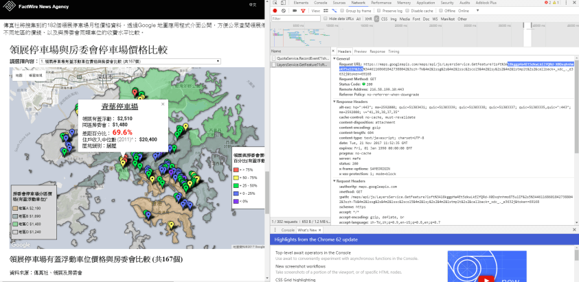
圖:通過網絡抓包分析 Fusion Table 的 ID
07 Tuesday Nov 2017
Tags
canva, Google Chart, infogram, Kumu, StoryMapJS, Tableau, TimelineJS

Source: Wiki Commons
There are a lot “one-click” tools available online that help you to create good visualisation and export to iframe for embedding into your site. Good use of those tools can better present your content to the readers. Note that the free version of WordPress hosted service does not allow embedding iframe, so they can only rely on shortcodes. For example, one can use is to embed interactive charts generated from Google Sheets. See more options of available shortcodes for free version here
Data and News Society is operated on a paid plan so we installed the iframe plugin. This makes it possible to enable a wide range of 3rd party visualisation into your project. This tutorial is contributed by Jade Li to demo how to embed interactive content from several common tools. The general workflow is to first export the 3rd party project as iframe, find the URL in the src=”” section, and use [ iframe src=”” ] to embed it into WordPress.
07 Tuesday Nov 2017
Tags
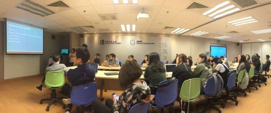
The 2-day Data Journalism Boot Camp was successfully held in HKBU on Oct 26 and Oct 27. The event was sponsored by KAS and the workshop sessions were led by two experienced trainers from DataLEADS. Another highlight of the event was a roundtable discussion chaired by Prof. Ying Chen, where professionals shared their practices, challenges and solutions in the newsrooms.