Time: Nov. 2, 2018 (Fri.), 11:00 a.m.-12:20 p.m.
Venue: CVA 506, HKBU
Speaker: Andy Shu
Language: English


24 Wednesday Oct 2018
Posted in Announcement, Announcements, general, news story, Open Lecture, Tool
12 Monday Feb 2018
Tags
轉載自 全球深度報導網 Repost from Global Investigative Journalism Network (GIJN)
Original Article(本文由簡體中文轉爲繁體中文)
媒體在數字化轉型中,越來越多地用數據可視化作為呈現方式。但許多可視化的作品只是追求形式上的美感,沒有實現數據可視化真正的功能:清晰有效地傳達信息,使讀者更形象地理解數字背後的含義。媒體推出的可視化新聞良莠不齊,水準忽上忽下,卻少有懂行的同行或讀者給予反饋。本週的數據新聞給讀者介紹由Perceptual Edge網站創始人、信息視覺化專家Stephen Few提出的一個標準化衡量規則,評價可視化是否達到了必要的效果。
Few認為,標準化的規則能讓大眾針對同一個方面給予評價,而不只再用空泛的語言描述一些模糊的印象。他認為,可視化的效果分為兩大類,分別是信息豐富性(Informative)和情緒感染力(Emotive)。前者考量的是數據可視化能讓讀者接收到多少信息,後者則衡量能否讓讀者產生一定的情緒反饋。在這兩大類之下,還有七個細分的小標準。信息豐富性涵蓋了五個維度:實用性、完整性、讀者接受度、真實性和直觀性。情緒感染力有兩層含義:一個是美感,另一個是用戶參與度。
05 Friday Jan 2018
Posted in general, news story, Resources
Tags
On December 22, 2017, President Trump signed the Tax Cuts and Jobs Act. How does it matter to the companies and citizens?
Tax is one of the crucial parts of the country’s economic. Under the globalization, US tax policy might relevant to your life. The economic trends could affect you and the steps you might need to take so you can profit from it. Moreover, there are lots of data in the tax policies which could turn into some good data news. This week we will share some Trump’s new GOP tax cut plan data news.
The whole tax bill cuts the corporate tax rate from 35% to 21% and the top individual tax rate will drop to 37%, which used to be 39.6% in 2017.
The following chart shows the progressive tax rate before and after the bill, in one Table. We find that table is an effective way to display data with high density. It seems the tax will be deducted for everyone except for the lowest income bracket.

Read more: Corporate Income Tax: Definition, History, Effective Rate
22 Wednesday Nov 2017
Posted in general, news story, Resources
Do you still remember the massive Panama Paper leak in 2016? When 13.4 million financial documents were released in this November, the offshore paradise islands got global attention again. Paradise Papers cover the time period from 1950 to 2016, including the more than 120,000 people and 25,000 offshore companies.
Tech-savvy readers can jump to the database directly. Like before, the dataset is modelled as a graph, namely treating the Officers, Intermediaries and Addresses as nodes and their relationships as links. Neo4j is one widely adopted graph database. Its web user interface, called “neo4j browser”, allows journalists to visually expand and explore a graph. The query language “Cypher” is a superset of relational query (SQL), full-text search and graph pattern matching. Its flexibility and built-in graph algorithms allow experienced journalists to systematically study the underlying graph. The download page on ICIJ includes snapshots of four neo4j databases exported in CSV format.
29 Sunday Oct 2017
Tags
The closing session of 19th National Congress of the Communist Party of China finished this week. New Politburo Standing Committee presented to the Media, putting Beijing in the centre of world attention. This DNW hand-picks recent data news related to Power in China.
Bloomberg Politics made an unconventional data visualisation to show The Path to Power in China. Readers can easily tell running a Big Region is important in China, by reading the following line chart. The chart successfully turned categorical position data into ordinal data by sorting the importance, namely number of people who entered Standing Committee from that position.

28 Monday Aug 2017
(This is a repost from initiumlab.com by Chao Tianyi, click the link to read the original: 關係圖表速成方案:Google Fusion Tables & Kumu)
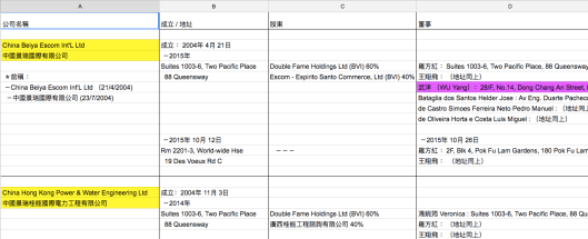
2015年下半年,中紀委反腐風暴席捲石油界,多名巨頭遭到中央拘捕和調查。相同時期,香港商人徐京華在北京一家酒店被帶走。徐身份神秘,擁有多個國籍和化名,長期從事中國和非州兩國石油貿易。端傳媒曾製作重磅調查報導,揭開徐京華的跨國能源帝國如何運作,以及他和中石化的關係。調查過程中,記者挖掘出了大量人物之間、公司之間、人物與公司之間的材料,此時,繪製一張關係圖顯得非常必要,藉此,記者可以深度挖掘隱匿在網絡中的信息。
如何迅速製作出一張圖呢?本文會提供 Google Fusion Tables 和 Kumu 兩種方案。
不論採用哪種工具製作,最初都需要將原始資料從 research notes 整理成結構化的信息。
28 Monday Aug 2017
Tags
(This is a repost from initiumlab.com by Chao Tianyi, click the link to read the original: 整日做表沒思路?Google幫你開腦洞)
一個數據分析項目,往往始於摸索一張龐大而陌生的數據表格。嘗試畫些簡易圖表是啟發思路的好辦法,但這絕非易事──想想有多少種圖表:直方圖柱狀圖餅圖折線圖雷達圖……若選取不同的列來分析,每種圖表又有多達幾十種畫法。
Google Sheets 最近推出了一項新功能 Explore,或許能成為探索陌生數據的第一步。Google 介紹稱,Explore 能根據表格內容自動生成盡可能多的圖表,還順帶做些數據分析,挖掘數據的關聯和趨勢[1]。
Explore 的使用方法很簡單,一次點擊就能自動出圖,不時還會附上(它認為)有趣的發現,例如列舉最大值和最小值等。
28 Monday Aug 2017
Tags
(This is a repost from initiumlab.com by Chao Tianyi, click the link to read the original: Google Sheets 技巧總結)
與 Excel 一樣,Google Sheets 也是常用的數據清洗和分析工具,不同的是, Google Sheets 還支持在線協操和實時保存功能。當需處理的數據量級不是特別大,或是分析難度不是特別高時,Google Sheets 可以算作最順手、最高效的工具了。以下,我們總結出6個 Google Sheets 的使用技巧,幫助大家更加熟練地掌握它。
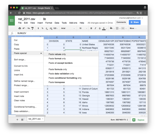
在 Google Sheets 的每個格子裡,數據存在的格式並不僅僅是文字或數字這麼簡單,有時它可能是一串公式,有時又會是邏輯判斷。所以,當需要使用複製粘貼功能時,別忘記確認你粘貼過去的內容是什麼。如果你需要的只是格子裡的值(value,即數字或文字)而非一串公式,那你需要在粘貼時點選「Paste Special」-「Values Only」(或者採用 Command+Shift+V),這樣,就可以防止粘貼一堆亂碼去新的表格了。
25 Friday Aug 2017
Posted in Colloquium, Event, general, news story, Opinion
Tags
(This is a repost from initiumlab.com by Chia ni Liu, click the link to read the original: 哥大資料視覺化大師 Soma 在浸會大學的密技分享)
Data Journalism 是一門極大的學問,從搜集資料、清理、修正、分析、到找到好故事的過程中大概有幾百種可以學的技能或是知識。在有限的時間和精力下,哥倫比亞大學著名的大師 Jonathan Soma 建議記者至少學好設計,使用適當的手法呈現資料,讓讀者能在最短的時間內吸收資訊。那麼資料視覺化都有哪些機密呢?
13 Saturday May 2017
Posted in Colloquium, Event, general, news story, Opinion
Tags
(This is a repost from initiumlab.com by Chia ni Liu, click the link to read the original: 哥大資料視覺化大師 Soma 在浸會大學的密技分享)
Data Journalism 是一門極大的學問,從搜集資料、清理、修正、分析、到找到好故事的過程中大概有幾百種可以學的技能或是知識。在有限的時間和精力下,哥倫比亞大學著名的大師 Jonathan Soma 建議記者至少學好設計,使用適當的手法呈現資料,讓讀者能在最短的時間內吸收資訊。那麼資料視覺化都有哪些機密呢?
