
Tags
Data visualization sometimes can be very similar, data news use bar charts and lines to show the details. From this articles we can have another thought about using easy hand drawing to enhance the reading experience:
1.Hand Drawing
Mona Chalabi is data editor at Guardian US. She previously worked at FiveThirtyEight, the Bank of England, the Economist Intelligence Unit, Transparency International and the International Organisation for Migration.
A. Equal Pay Day: a wage gap fact check

The gender wage gap varies depending on where you work, how old you are, your educational status and your race or ethnicity.
Photograph: Mona Chalabi
More to read: Equal Pay Day: a wage gap fact check
B. Why did Trump’s government reverse transgender rights?
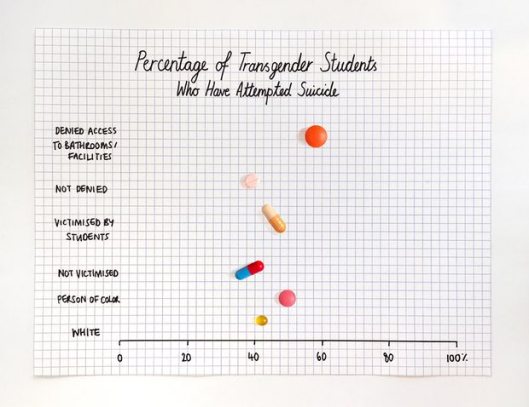
Percentage of transgender students who have attempted suicide.
Photograph: Mona Chalabi
More to read: Why did Trump’s government reverse transgender rights?
C. Is the National Weather Service lying to you?

The weatherman: his guess is slightly better than yours. Probably.
Photograph: Mona Chalabi
More to read: Is the National Weather Service lying to you?
2.Finding the Right Color Palettes for Data Visualizations
Samantha Zhang is a Design lead at GraphiqHQ, Likes called herself Data nerd. She shared her idea about how to design your color palettes for data visualizations.
While good color palettes are easy to come by these days, finding the right color palette for data visualizations is still quite challenging.
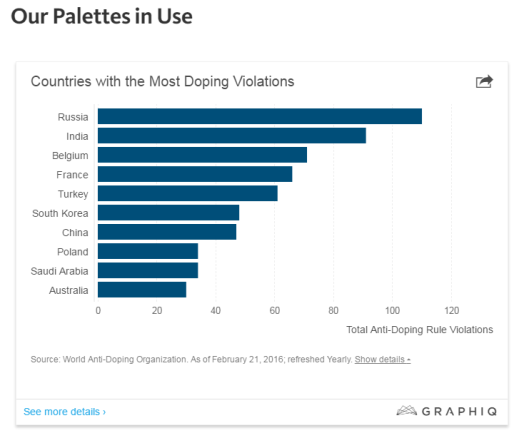
When you click the picture you can read more details and you can learn how was this viz created.
Don’t limit yourself and keep on learning a new way to help your data visualization.
