
Do you consider your personal information well protected? You use different passwords for different accounts, keep your social network activity private, even fake your profile on social media. Your efforts are probably in vain.
Everything you have done is under surveillance and your life pattern can even be figured out by people who are thousands of millions away from you. The government knows that you called Daisy three times in twenty-four hours, with one after midnight. You use Google Map in Central, Hong Kong at 2pm and your route is also recorded. You may wonder: I am just nobody. Why will somebody spare effort to analyze my data? In fact, you are somebody. Three degrees of separation points out that if you have 190 friends on Facebook, then after “three hops”, the network you can reach is even bigger than the population of Colorado.

Graph 1: The interactive graph with a draggable bar illustrates how many people you can reach after “three hops” based on the original size of your social network
These facts are delivered in The Guardian’s report NSA Files: Decoded on global surveillance. Edward Snowden, an ex-contractor of United States National Security Agency (NSA), continuously revealed top-secret documents throughout 2013, which contained details about NSA and its international partners’ surveillance over foreign nationals and U.S. citizens. The files leak set the whole world into panic and NSA’s sophistry – if you have nothing to hide, you have nothing to fear – wasn’t convincing enough.
Data leak is a big issue that worth paying attention to. Apart from Snowden, Julian Assange and “John Doe” also managed to uncover some dark sides, leading the revelation of the WikiLeaks and the Panama Papers. More information about these two cases can be found in the comparison part at the end of the article. Let’s first focus on The Guardian’s report NSA Files: Decoded, from the perspective of techniques and news, to explore how it presents a good news story with data.
1.Techniques: How do they visualize the data in multiple ways?
The story adopts a full range of techniques to interpret data, render the relationship between different factors and realize interactions between readers and the article. For example, in Graph 1 shown above, when readers drag the bar indicating the number of friends you have on Facebook, exact number (e.g. “5,072,916” in 3rd degree) and description (e.g. “or more than the population of Colorado” in 3rd degree) are written by JavaScript. It clarifies how huge the number of people caught up in this dragnet can be.
Below are a series of highlighted techniques that are used in this report:
1.1 The application of D3
Like many of today’s multimedia journalism projects, this one utilizes the D3.js framework to power the interactive data visualizations. D3 is used to create or modify elements on the page based on user input. In this case, the framework was well suited to power things like an interactive chart breaking down congressional votes on NSA-related legislation and a visualization detailing who sits on the FISA Court, broken down by demographics and political party.

Select the category and the charts will change interactively. The eligible judges will be colored in red while the others remain grey. It is also reader-friendly as readers can match the name with term easily as there is a shallow red rectangle hovering on the row.

They also apply d3 to power interactive data visualizations. They create an SVG “layer” at first to define the area and then add other elements on the layer using translate() function, <rect> and <line>.
Here are another two examples implementing D3. The first one demonstrates the kinds of information you leak through different channels. The bubbles (also the background of information type) are drawn with SVG. The second one illustrates the degree of cross-partisan of vote including the Vote to limit NSA Data Collection, which proved to be one of the least partisan votes, beaten only by food aid reform and flood protection.


1.2 Video
The story comes from perspectives of eminent figures from different industry who are related or affected by the issue in some degree. The intention for them to let the readers digest the whole story from a vantage point. The videos are helpful to construct the whole story in an immersive and engaging way and it can help frame the reader’s own opinions based on the interview quotes from other figures.
Shooting the videos in front of the green screen, the interview videos are presented in a seemingly face-to-face interaction way. They can immediately engage readers and pique the curiosity.

This image is captured from the video on the top in which the information related to the speaker is presented alongside in the blank. The file-alike image and wave charts on the left are kind of satire on the government surveillance as they are meant for privacy to some extent.
1.3 Embedded Document-DocumentCloud
The report embed several original documents which feels more reliable and convinced. The document all come from a platform called DocumentCloud.
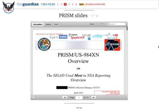
According to Wikipedia, DocumentCloud is an open-source “software as a service”(SaaS) platform that allows users to upload, analyze, annotate, collaborate on and publish primary source documents. Since its launch in 2009, it has been used primarily by journalists to find information in the documents they gathered. The platform now owns one more million public files contributed by the journalists worldwide.
Simply by pasting the embed code, we can insert a document on the web page easily. However, the embed function is only available to the registered users who are professional journalists already working in the press agencies. And the passage can only be embedded by the authors who would like to share the file, no matter is private or public. The operation flow is basically like, the journalist upload the file to the DocumentCloud and if his story requires the insertion of the document, he can choose to publish the doc. Then the public has access to read and download the file in PDF format. It can also easily direct to the published news report using the document when browsing.
They’ve got some demo code on the official website. We tried to paste them in the visual studio and here is the outcome:


Besides DocumentCloud, Thomson Reuters Open Calais is another tool that can help you to do the data analysis in a file. It helps you find the meaningful relationships that will be overlooked by conventional search engines. It also has a function called PermID which can be used to search for some permanent business information.
1.4. Infographic design

To better illustrate the two crypto encryption systems, the story also uses workflow chart and animation to visualize the whole procedure of PGP and TOR securing the computers. In this way, readers can understand the procedure reading animation instead of texts more easily.
1.5 Charts
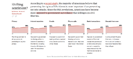
Areas charts are applied here to indicate the American people’s sentimental shifting towards government surveillance. The changes in percentage are obvious and easy to read. However, it can be quite confusing since the passage mentions “the shift is reflected in the change in the attitudes over the past two years on a series of privacy issues” while the scale of the x-axis in the chart shown below is from 2011 to 2020. There is actually no concrete correlation between the 6th chart and its caption as well. If you read the subtitles of the charts carefully, it is not hard to find the previous charts are subordinated to the last one but here in the passage, they are presented in the same row. This section generally looks fancy but the charts are quite ambiguous and improper allocated.
1.6 Interactive Elements
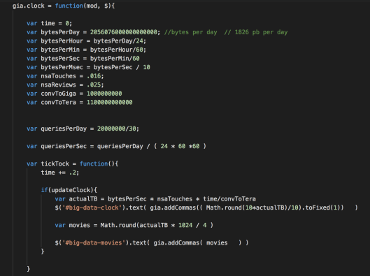
1.6.1 Big Data Clock
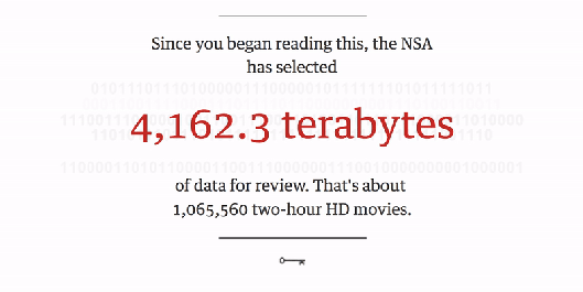
This graph shows the amount of data the NSA has collected since you began reading this article, with a conversion of terabytes to the number of two-hour HD movies, which makes it more intuitive. It is also enabled with JavaScript. Here is part of the codes that help to visualize it:
1.6.2 Portrait Series

The collection of portraits appears at the beginning of the article. It shows the names, titles, opinions and actions towards NSA surveillance of those who involved in the issue. Mouse hovering at a figure triggers the appearance of his information. Hovering at the text “Snowden’s” in the passage also enable Snowden’s portrait highlighted.
It is visualized with CSS and HTML. The background image changes when the mouse hovers at a certain figure. Adopting this method results in a drawback – the text in this graph can’t stay or be selected after mouse moves away.
1.7 3D Interactive Globe Model
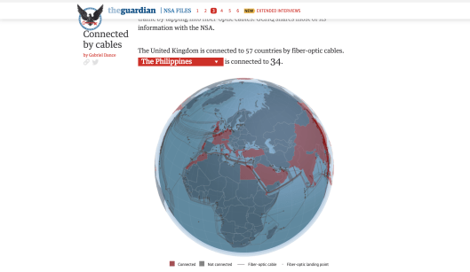
The article attributes the rapid expansion of surveillance to two factors: fear of terrorism and overwhelming digital revolution. Since US and UK own much of the world’s communication traffic passing through and NSA in the US have access to data gathered by close intelligence partners like GCHQ in the UK, the article presents the fiber-optic cables connected to each country in the 3D interactive global model (powered by https://www.telegeography.com ). The advantage of this model is that readers can understand the exact path fiber-optic cables pass through and countries are they connected to.
Yet, when comparing the mapping with the example from the Panama papers by Süddeutsche Zeitung, the Guardian one focuses on the visualization part too much and as a result, the report is not in-depth enough to help readers reframe their own opinions on the need of protection against terrorism versus protection of individual privacy. While the Süddeutsche Zeitung one is more like a collection of the leaked reports that helps readers to understand the scale of the offshore companies.
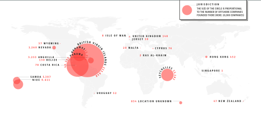
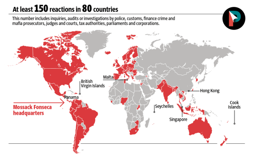
Map of the Offshore companies founded by Mossack Fonseca. Chart: Süddeutsche Zeitung
2.Text
Data journalism is also one type of news reporting, not only showing the data but also tell a profound story. From the text perspective, it’s an excellent data journalism piece that able to elaborate the evidence and information clearly and attractively.
2.1 Attractive title and leads
It’s undoubtedly that the reporter uses an attractive headline “What the revelations mean for you” to draw the attention of readers. When you see the title, you are likely to ask “what are these revelations?” and “what do they matter to me?” Readers will have a magical cognition about the word “decoded” because human beings always want to explore what they never know before. Besides, the news reporting begins with an eye-catching lead about Edward Snowden’s story when meeting journalists in Hong Kong to make an “anecdotal lead”.
2.2 Supportive sources
The report is supported by important responses by the related parties with different perspectives on PRISM, including U.S. congresswoman, former NSA general counsel, U.S. senator, deputy legal director, ACLU, a lawyer from Electronic Privacy Information Center, etc. As a result, readers can have a more balanced view of the event.
2.3 Newsworthiness
“It is this program that has dominated US political debate since then … the debate Snowden wanted is happening. That in itself is a major achievement. But the debate has expanded well beyond the confines of Capitol Hill, touching on individuals and groups throughout the US and elsewhere in the world.”
We can see that the influence of the news story was so strong that the debate expanded worldwide gradually. Also, different parties including politicians, economists, privacy activists, judges and other parties began discussion on the digital revolution, reform of law and other related matters. It truly raised people awareness on their privacy on the Internet.
3. Drawbacks
However, we still found some drawbacks of this news story. First, it isn’t fully responsive on all devices. For example, it will get a sudden jump of some images when reading on the mobile phone.

If you use the size of the web page like at the beginning of the gif below, you can’t use the “red triangle” to choose the person that you want to know normally. However, if you enlarge the size of the web page, you can use the “red triangle” button smoothly.

Second, readers can’t stay and choose the text shown in the graph. For example, if we chose “Dianne Feinstein” and we find an unknown word or a sentence difficult to understand, we can’t copy the word or the sentence we want because of the unstable state of each person’s image with comments.
Third, there’s a popup window that asks readers to tweet whenever readers tried to copy something from the original article even just a word.
Lastly, there’s no video subtitle. It’s not reader friendly for non-native English readers. Even if the readers are English native speakers, it’s possible that they can’t hear all words clearly. Hence, we think it’s better to add subtitles to each video.
Comparison with other related cases
We also found another two articles about information leaking events and some hidden fact reporting:“PANAMA PAPERS- The secrets of dirty money” and “Wikileaks data journalism: how we handled the data” with different strengths and shortages.
Panama papers:
It has lots of simple graphics about different leaks, including “Panama’s bear”, “Dangerously close”, “Putin’s rich friends” and so on. It is simple, clean, and with consolidated style. After all, data visualization is not only about interactive charts, elements like infographics or photographs can also be good choices.
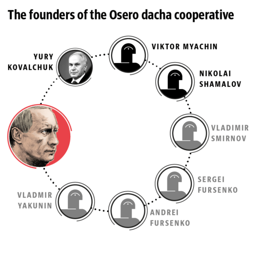
“Putin’s rich friends” clearly shows the relationships between the founders of the Osero dacha cooperative.
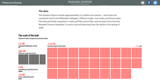
Another great example that represent the scale of the leak. Strong contrast between black and red is used to emphasize the scale.
Wikileak:
The website from the Guardian about Wikileaks is a little bit different from the Panama papers.
“Wikileaks has been the game-changer for data journalism. See how we handled the numbers.”
It uses various kinds of data visualization techniques like a map, IED (Improvised Explosive Device) interactive, IEDs’ distribution by map, Wikileaks cables broke down, etc. This is another way of presenting data.
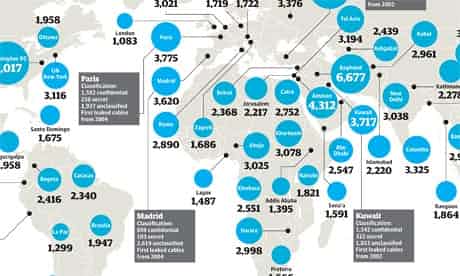
Wikileaks cables breakdown. Infographic: Finbarr Sheehy.
It is worth mentioning that the quality of images are not very high because the website was forbidden before and some original URLs, data and graphics are missing.
Conclusion
To conclude, we should find the most suitable presenting way for what you want to show to the public and show most important and newsworthy things as much as possible by different kinds of formats when doing news reporting as a journalist.
References:
Panama leak report from Süddeutsche Zeitung: http://panamapapers.sueddeutsche.de/en/
Wikileaks:
Wikileak: How Guardian handle the data:
https://www.theguardian.com/news/datablog/2011/jan/31/wikileaks-data-journalism
Panama papers related: A interactive game: Stairway to Tax Heaven:
https://www.icij.org/investigations/panama-papers/stairway-tax-heaven/
Some technical analysis:
https://source.opennews.org/articles/how-we-made-nsa-files-decoded/
https://www.fastcompany.com/3021837/how-journalists-at-the-guardian-built-that-epic-nsa-story
https://www.theguardian.com/world/2013/oct/10/guardian-democracy-editors
Author/ Bonnie YU, Wang Jingwen and Annie QIU ( JOUR2106 Data Visualisation (2018) – Group 5 )
Editor/ Jessie Pang
Data News of the Week (DNW) is a weekly issue of news summaries hand picked by our editors. It features a GLOCAL (global+local) perspective for the topic of concern. It tracks the latest developments from the industry and academics for methodology, tools, datasets and news agenda.
