
It is time to break-down the broad concept of “data journalism”. When talking about the combination of data and news, we usually refer to two processes, sometimes conducted in an integral manner. One process is to discover news points from datasets. The datasets can provide a lead for further investigation. The final product does not necessarily reflect the usage of data. It may look the same as normal news products mainly composed of interviews and photos. This is called “data mining” in the science domain. Another process is to present news points using data. There come to all kinds of charts and interactive/ immersive presentations. This is called “data visualisation” in the science domain.
Let’s focus on the “data mining” part in this article. That is to discover news from datasets, or more precisely discover a news lead from datasets. The further development of the entire news story may take much more efforts with a combination of traditional and modern methods. For easier discussion, we treat “news” in the general form: something the audience does not know before reading, a.k.a, something that “appears new”. It could be the status update of a current affair, or it could be the “new knowledge” to the readers (probably be “common knowledge” to experts which we don’t want to waste time debating).
As advocated by the “Road to Jan”: the most profound theory takes the simplest form. As a first step, we try not using programming, or even sophisticated spreadsheet skills. One can readily find some “news” with a bit “nose for news” and be computer literate is good enough. In this article, we will demo a few news points mined by our undergraduate students from Hong Kong government data portal: https://data.gov.hk . It took around 20 minutes in the second class of a data journalism course. We start with a public dataset from the portal, check out the data tables and eyeball if there is anything interesting. The process is so quick that we would like to give it a brand name: Lightning News. One can sharpen his/her news sense and data sense by doing this as daily exercise.
Dataset: A103b Median Age, Median Age (Excluding Foreign Domestic Helpers) by Sex and Year (English)
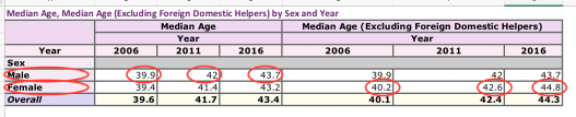
- The last row shows the aging phenomenon of Hong Kong in past decade.
- Comparing the male and female media age, with greater values highlighted in red, we can find that: women are in general older, if not for domestic helpers.
- The male row stays the same with or without the foreign domestic helper. Is there none male domestic helper or is it a minor difference hidden by statistics? Quick answer: yes there exist male helpers. Are you interested in learning their stories?
Dataset: Government Expenditure on Education (English)
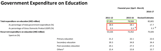
- Checking the government expenditure on education, the absolute value is increasing (highlighted in Green) and the percentage, either as a share of GDP or a share of overall government expenditure, is decreasing (highlighted in Red).
- Is government spending more or less on education?
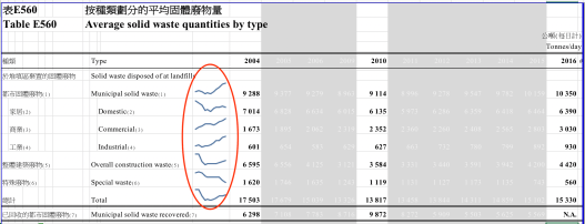
Dataset: Table E560: Average solid waste quantities by type
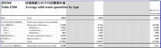
- There are more data points in this table than previous examples. A common method is to “lowlight” (grey-white coloured) some details in order to find things that matter. We are usually interested in the starting point/ end point/ middle point. Use eyeballing to quickly identify the shapes of your data. There are four common shapes: /, , V, ^. It is very easy to tell a corresponding story about the trend. (Sampling)
- Municipal solid waste was increasing, within which domestic waste was slightly decreasing, commercial waste nearly doubled and industrial waste increased by half.
- Is there a structural transformation in our city’s economy?
Note, this data set is also suitable to be visualised by sparkline. Check out the HOWTO article and following example:
Dataset: Statistics of Subsidy Scheme for Internet Access Charges
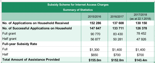
- Both the number of applicants and number of successful cases are decreasing.
- Questions: What are the reasons for unsuccessful applicants? Does this trend mean the economy is getting better or simply the criteria are tightened?
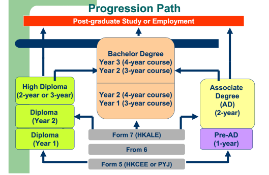
Dataset: Distribution of Educational Attainment of Population Aged 15 and Over
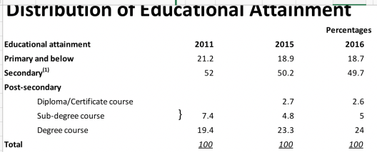
- Numbers in “Primary and blow” and “secondary” are decreasing. Does it mean we have a better overall education level? Is it because more young people attend high education or old people pass away?
- What are the potential paths to degree course? A more general question is to ask what are the potential educational/ professional paths for students after primary school?
A quick Internet search may already lead to some news to non-local readers. Mainland readers who just experienced decades of standardised/ uniform education system will soon find it interesting that secondary school spans 5-7 years and college/ university spans 2-5 years.
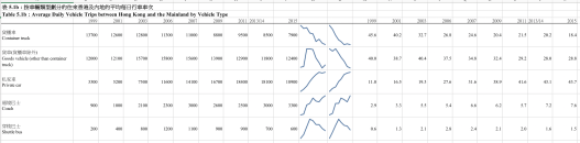
Dataset: Tables 5: Cross-boundary Vehicle Trips (English and Traditional Chinese Version)
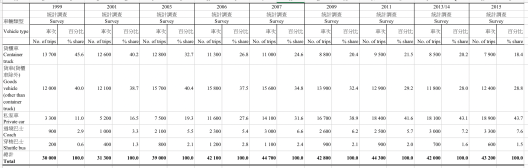
- 5.1b shows the cross-border vehicle by type by year. The numbers changed a lot in past 16 years. One can easily spot the headline: more people, fewer goods.
- Is it an indicator of more frequent communication between the two sides or is it a consequence of loosened border policies?
- There are other tabs in from the same Excel file for further exploration: traffic by weekday, traffic by border control points, traffic by source/ destination inside Hong Kong, traffic by source/ destination outside Hong Kong, percentage of number of passengers, purpose of the trips, duration of stay in Hong Kong/ mainland. — Those cross-tabs actually answer the common questions of who, what, when, where, how and why. A more common situation is that those elements may not be readily available upon the first encounter of a single data set. Once a lead is discovered, one needs to leverage multiple journalistic approaches to find other W’s.
An additional note to the main story point here — sparkline is again used to present the data in a compact manner. Some reorganisation of the original data table is needed before drawing the lines. Also, note that Sparkline is not available in Excel prior to 2010 or when in compatibility mode. You may want to “save as” the new format and re-open Excel before processing.
Dataset: Projections of Population Distribution (2014 – 2024)
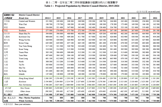
- (Green) Among the three major regions, the population of Hong Kong Island will decrease while Kowloon and New Territories are projected to have significant growth. Here we uncover a trend and can ask questions like: Is it because of natural birth/ death rate or is it because of more affordable housing in KL/NT?
- (Red) Now that HK Island sees a decrease in general, we break down and find that population of Southern District is unchanged or even slightly increased. Is it because of better transportation (e.g. South Island line)? Or more employment opportunities (e.g. Cyberport)?
Dataset: Summary on Causative Agents for Food Poisoning Outbreaks in 2007 (English)
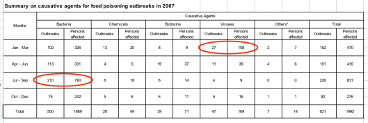
- Bacteria and virus are two major causative agents of food poisoning in 2017.
- Bacteria causative peaks in summer and virus causative peaks in winter. Is it a seasonal effect or just 2017’s special event? One may want to check out the data of other years. In either case, one will find a piece of news: a seasonal effect is a pattern and new knowledge; a special outbreak is an outlier and new information.
Dataset: salary index
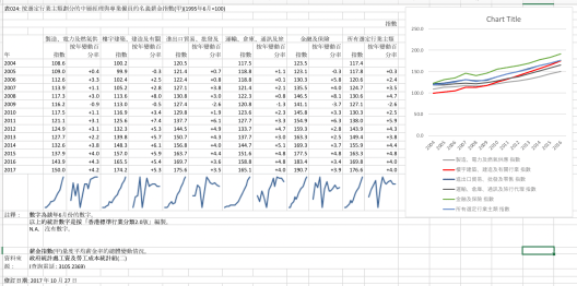
- As the last example, we directly give the visualisation although one can still eyeball several news points. There are multiple stories to tell like finance & insurance sector stays on top for a decade, or the gap between finance and others are closing except for the manufacturing and energy sectors.
- Before getting too excited and moving to writings, we need always check the scope/ limit of the dataset. The upper left corner clearly labeled: those statistics are from management level and professional employees. That explains why the gap in the table feels much less than that in our impression.
Conclusion of the methodology
From those cases, we can easily see that there are two apparent methods to mine news points from datasets. One is to summarise data points and uncover trends/ patterns/ common phenomenon. The other one is to check individual data points against the pattern to find outliers/ anomalies/ uncommon phenomenon. To discover trends, one quick way is to check the shape of the data and / V ^ are the common shapes regarding time series data. Patterns can be distribution (central/ spread) and underlying structure but those are beyond the current article which relies on mere eyeballing. To discover outlier, the most useful way is to check minimum and maximum. Comparing with average/ median/ mode is also handy sometimes. For a composite structure, drill-down is an useful technique and is usually applied to geographical values and date-time values. When one news point, or a lead, surfaces, one may want to find more news points by asking the 6 W’s questions, i.e. who, what, when, where, how and why. This usually involves correlating with other datasets. The last note is that Who/What/When/Where are often directly told by data but How is less and Why is seldom. When there is an interesting lead, it is the journalist’s job to investigate and find out the internal works and to seek truths/ insights to explain the observations.
The datasets and annotated screenshots in above examples can be downloaded here: mining-lightning-news-from-public-data-sets-files.zip

Pingback: Using Big Data to Figure Out How Fair China Daily News is – The Data & News Society