• Home
  • Event
  • Article
    • Gallery
    • Opinion
    • Resources
  • About
    • Founding Members
    • Steering Committee
    • Executive Officers
  • Newsletter

The Data & News Society

~ news/numbers; stats/stories

The Data & News Society

Tag Archives: Data Vis

Data News of the Week | Power in China

29 Sunday Oct 2017

Posted by Bobo Wei in general, Opinion, Resources

≈ 1 Comment

Tags

data, data cases, Data Journalism, Data Vis, DNW

The closing session of 19th National Congress of the Communist Party of China finished this week. New Politburo Standing Committee presented to the Media, putting Beijing in the centre of world attention. This DNW hand-picks recent data news related to Power in China.

☞ 25 year’s political path to Power in China [Link]

Bloomberg Politics made an unconventional data visualisation to show The Path to Power in China. Readers can easily tell running a Big Region is important in China, by reading the following line chart. The chart successfully turned categorical position data into ordinal data by sorting the importance, namely number of people who entered Standing Committee from that position.

1

Continue reading →

Map Visualisation for Panama Papers and Offshore Leaks in R

29 Tuesday Aug 2017

Posted by Bobo Wei in Resources, Tool

≈ Leave a comment

Tags

data, Data Vis, open data, R

(This is a repost from initiumlab.com by Charlie Chen, Chao Tianyi, click the link to read the original: Map Visualisation for Panama Papers and Offshore Leaks in R)

On May 9, 2016, the International Consortium of Investigative Journalists (“ICIJ” in short), a global network of journalists who collaborates on in-depth and investigative stories, released the long awaited offshore entities database behind Panama Papers Investigation.

So far, the offshore leaks database published by ICIJ includes at least 200,000 offshore entities from Panama Papers, and over 100,000 records from ICIJ’s previous investigations.

The offshore leaks database contains detailed contact postal address of all kinds of entities, offshore or non-offshore ones, officers and intermediaries, based on which we made colored maps revealing the distribution of postal address of people or companies involved in the offshore industry.

Continue reading →

哥大資料視覺化大師 Soma 在浸會大學的密技分享

25 Friday Aug 2017

Posted by Bobo Wei in Colloquium, Event, general, news story, Opinion

≈ Leave a comment

Tags

Data Journalism, Data Vis

(This is a repost from initiumlab.com by Chia ni Liu, click the link to read the original: 哥大資料視覺化大師 Soma 在浸會大學的密技分享)

Data Journalism 是一門極大的學問,從搜集資料、清理、修正、分析、到找到好故事的過程中大概有幾百種可以學的技能或是知識。在有限的時間和精力下,哥倫比亞大學著名的大師 Jonathan Soma 建議記者至少學好設計,使用適當的手法呈現資料,讓讀者能在最短的時間內吸收資訊。那麼資料視覺化都有哪些機密呢?

核心觀念:

  1. 越多的資料想要呈現,讀者能接收到的資訊越少。
  2. 站在讀者的角度思考,只專注在讀者需要知道的資訊上。

Continue reading →

數據新聞的精選 Feed 列表

25 Friday Aug 2017

Posted by Bobo Wei in Resources, Tool

≈ Leave a comment

Tags

Data Journalism, Data Vis

(This is a repost from initiumlab.com by Chia ni Liu, click the link to read the original: 數據新聞的精選 Feed 列表)

「怎麼樣才能做出一篇好的數據新聞呢?」
「就三招!多看、多想、多學」。

這邊推薦一些 Data Journalism 相關的好站,讓你從平時就可以培養數據素養,從不同面向來探索跟學習數據新聞。

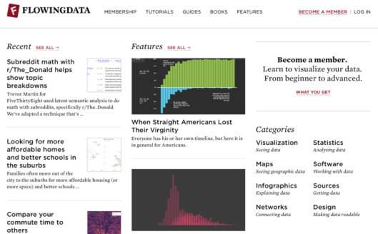
  1. #Flowing Data

由出過兩本資料視覺化暢銷書的 UCLA 統計學博士 Nathan Yau 所創,網站旨在探索資料視覺化跟資料分析的可能性。其中可以看到大量不同類型的圖表(包括資訊圖表或是互動性圖表等),還有設計準則跟工具類的教學文。最大的特點是更新頻繁,題材都很生活化。

Flowingdata.png

Link: 點擊訪問 Flowing Data

Continue reading →

More Than a Nuisance–A multimedia report on the noisy China that you don’t know, or have already “heard” of.

15 Tuesday Aug 2017

Posted by Bobo Wei in Gallery, news story

≈ Leave a comment

Tags

data, Data Journalism, Data Vis, JOUR2106, map, sounds

(This is a repost from the students’ final projects of the DATA VISUALIZATION FOR NEWS @ HKBU Spring 2017, click the link to read the original: More Than a Nuisance)

“The noises used to be ignored were proved to be more than a nuisance, but a signal, a potential threat, and a hidden bomb of our urban life, that needs to be taken care of with greater attention.”

Julianna Wu, Fred Lai & Roy Tang make the project in a multimedia way to report on the noisy China. Including maps, charts, sounds, timeline…

Continue reading →

哥大資料視覺化大師 Soma 在浸會大學的密技分享

13 Saturday May 2017

Posted by Bobo Wei in Colloquium, Event, general, news story, Opinion

≈ Leave a comment

Tags

Data Journalism, Data Vis

(This is a repost from initiumlab.com by Chia ni Liu, click the link to read the original: 哥大資料視覺化大師 Soma 在浸會大學的密技分享)

Data Journalism 是一門極大的學問,從搜集資料、清理、修正、分析、到找到好故事的過程中大概有幾百種可以學的技能或是知識。在有限的時間和精力下,哥倫比亞大學著名的大師 Jonathan Soma 建議記者至少學好設計,使用適當的手法呈現資料,讓讀者能在最短的時間內吸收資訊。那麼資料視覺化都有哪些機密呢?

核心觀念:

  1. 越多的資料想要呈現,讀者能接收到的資訊越少。
  2. 站在讀者的角度思考,只專注在讀者需要知道的資訊上。

Continue reading →

Hong Kong Long-term Competitiveness Research/香港長遠競爭力研究

29 Saturday Apr 2017

Posted by Bobo Wei in Gallery, Tool

≈ Leave a comment

Tags

data, Data Journalism, Data Vis, JOUR2106

(This is a repost from STUDENTS’ FINAL PROJECTS OF THETHE DATA VISUALIZATION FOR NEWS @ HKBU Spring 2017,click the link to read the full page: Hong Kong Long-term Competitiveness Research)

網頁通數據過圖表的方式呈現了香港的經濟、法治、國際網絡、勞動力等一系列的問題。研究是關於匯賢智庫發表有關香港長遠競爭力的報告,了解香港軟實力。香港的鄰近地區如新加坡,台灣,南韓等,正高速發展經濟及社會,競爭力不容忽視,本港競爭力正面臨挑戰。報告分析香港的優勢,困難及機遇,了解如何面對及計劃長遠政策。

Continue reading →

Travelling in North Korea (GloTravel)

29 Saturday Apr 2017

Posted by Bobo Wei in Gallery

≈ Leave a comment

Tags

data, Data Vis, JOUR2106, map

(This is a repost from STUDENTS’ FINAL PROJECTS OF THEDATA VISUALIZATION FOR NEWS @ HKBU Spring 2017,click the link to read the full page: Travelling in North Korea (GloTravel))

作者借由数据,通過地圖、時間軸等方式呈現了北韓的經濟、軍事、旅遊收入等問題,并以互動問答的形式幫助讀者計劃去北韓旅遊的行程。項目還同旅遊公司合作,形成了一個商業模式。

Continue reading →

Hong Kong Air Quality

29 Saturday Apr 2017

Posted by Bobo Wei in Gallery, Tool

≈ Leave a comment

Tags

charts, data, Data Journalism, Data Vis, JOUR2106, map

(This is a repost from STUDENTS’ FINAL PROJECTS OF THEDATA VISUALIZATION FOR NEWS @ HKBU Spring 2017,click the link to read the full page: Hong Kong Air Quality)

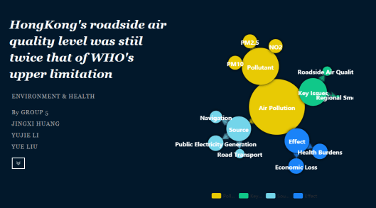
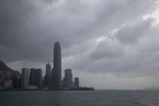
The project uses multimedia way to discusses the environmental protection problems, especially the air quality in Hong Kong.

Continue reading →

Li’s Force Field

29 Saturday Apr 2017

Posted by Bobo Wei in Gallery, Tool

≈ Leave a comment

Tags

data, Data Journalism, Data Vis, JOUR2106, map

(This is a repost from STUDENTS’ FINAL PROJECTS OF THEDATA VISUALIZATION FOR NEWS @ HKBU Spring 2017,click the link to read the full page: Li’s Force Field)

颱風是對香港有影響的主要自然災害之一,這個專題運用了互動地圖,表格等模式來呈現一個颱風和香港放假的專題。

Continue reading →

← Older posts
Newer posts →

Top Posts & Pages

  • The International Fur Trade: Data and Measurements
  • Create Simple Filled Map (HK) in Tableau
  • At a glance: Hong Kong poverty situation
  • Recap of SCMP infographic designers’ guest lecture in HKDI
  • The effectiveness of Hong Kong public libraries is diminishing

Recent Posts

  • A dossier of data journalism teaching strategies: Words from journalism educators worldwide
  • “中国数据可视化大赛”创作者专访:数据“几人行”
  • “Whoah, wait a minute, every reporter needs to be a data reporter”: Conversations with two generations of data journalists at the Los Angeles Times
  • Aaron Mendelson: Would numbers work with radio?
  • 首届“中国数据可视化大赛”启动-数据中的宏观和微观世界
  • Job Opportunity: Market Information Specialist at Unum Networks

Recent Comments

A quick video I made… on New towns fail to be self-cont…
Erin Chan on Create Simple Filled Map (HK)…
National Congress: s… on “Big Data” Tells Y…
Pili Hu on Data News of the Week | Gender…
Pili Hu on Key Takes from Jessica Lo…

Archives

  • August 2019
  • June 2019
  • April 2019
  • March 2019
  • February 2019
  • December 2018
  • November 2018
  • October 2018
  • September 2018
  • June 2018
  • May 2018
  • April 2018
  • March 2018
  • February 2018
  • January 2018
  • December 2017
  • November 2017
  • October 2017
  • September 2017
  • August 2017
  • May 2017
  • April 2017
  • March 2017
  • February 2017
  • January 2017
  • December 2016
  • November 2016
  • October 2016
  • September 2016
  • August 2016
  • July 2016
  • June 2016
  • May 2016
  • April 2016
  • March 2016
  • February 2016
  • January 2016
  • December 2015
  • November 2015

Meta

  • Register
  • Log in
  • Entries feed
  • Comments feed
  • WordPress.com

Recent Posts

  • A dossier of data journalism teaching strategies: Words from journalism educators worldwide
  • “中国数据可视化大赛”创作者专访:数据“几人行”
  • “Whoah, wait a minute, every reporter needs to be a data reporter”: Conversations with two generations of data journalists at the Los Angeles Times
  • Aaron Mendelson: Would numbers work with radio?
  • 首届“中国数据可视化大赛”启动-数据中的宏观和微观世界

Recent Comments

A quick video I made… on New towns fail to be self-cont…
Erin Chan on Create Simple Filled Map (HK)…
National Congress: s… on “Big Data” Tells Y…
Pili Hu on Data News of the Week | Gender…
Pili Hu on Key Takes from Jessica Lo…

Archives

  • August 2019
  • June 2019
  • April 2019
  • March 2019
  • February 2019
  • December 2018
  • November 2018
  • October 2018
  • September 2018
  • June 2018
  • May 2018
  • April 2018
  • March 2018
  • February 2018
  • January 2018
  • December 2017
  • November 2017
  • October 2017
  • September 2017
  • August 2017
  • May 2017
  • April 2017
  • March 2017
  • February 2017
  • January 2017
  • December 2016
  • November 2016
  • October 2016
  • September 2016
  • August 2016
  • July 2016
  • June 2016
  • May 2016
  • April 2016
  • March 2016
  • February 2016
  • January 2016
  • December 2015
  • November 2015

Categories

  • Announcement
  • Announcements
  • Article
  • Book
  • Colloquium
  • comment
  • Event
  • Field Trip
  • Gallery
  • general
  • news story
  • Open Lecture
  • Opinion
  • Resources
  • Tool
  • Tutorial
  • Uncategorized

Meta

  • Register
  • Log in
  • Entries feed
  • Comments feed
  • WordPress.com

Blog at WordPress.com.

  • Follow Following
    • The Data & News Society
    • Already have a WordPress.com account? Log in now.
    • The Data & News Society
    • Customize
    • Follow Following
    • Sign up
    • Log in
    • Report this content
    • View site in Reader
    • Manage subscriptions
    • Collapse this bar
 

Loading Comments...