
Tags
The project of Urban Noise is a interactive report concerning the urban noise issue in China, presented as a single web-page hosted on Github and integrated with multimedia attempts to visualize information. The team consisted of three journalism students and the production period took for around two weeks. This article is a brief tech review of the Urban Noise project, walking through how it was built up and what tools were used.
Web platform: GitHub, Bootstrap
In this project, the coding part was mainly done by two students not long after they have completed the course of Data Visualization for News, which equips students with web development basics (course materials). To find a webpage hosting platform and also start collaboration for coding, Github is the first tool to make use of (Github for hosting and collaboration). In our case, we chose to maintain one repository and merge commits to it (another way to collaborate could be Github Organization).
After dealing with hosting, development is the next step. Instead of using text editor preview function (“Preview on web server plug-in” on VS Code), I personally found setting up a local host could be more efficient in debugging with more satisfying JavaScript running performance (Local server setup).
Bootstrap provides web page templates, we chose one of the layouts from Bootstrap Templates and customized it for our own use. Bootstrap also provides easy web page styling by adopting its “grid system”. Our project’s “City Profiles of Soundscapes” is an example of using “grid system” styling to align elements. “Grid system” is also used to handle the web page responsiveness.
Interactive mapping: AngularJS
By using AngularJS (version 1.x), more interactive features can be realized by building executable web-apps. Picking up a new tool could be painful and time consuming. Now that AngularJS is such a sophisticated web front-end library, it seems impractical to master the tool before working on the project. In the case of “adversity of

noise” graph, the idea is as simple as mapping the noise dB values of user input and show the corresponding pictures. Therefore, the features that AngularJS provides immediate listening to input change and can manipulate web content simultaneously were utilised. Along with the most basic configuration, a single “ng-if” expression could be used to control the “display” or “hidden” of pictures according to the value of range input.
Part of the code is as below:
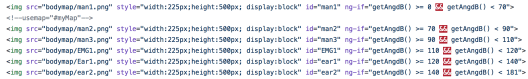
(picture is shown when the user input value falls into the “ng-if” condition )
Interactive Charting: ECharts


There are many good charting tools and libraries for creating quick visualization based on often-used chart models. They are handy and allow customization though sometimes scarce in originality. Since ECharts by Baidu was taught in the course Data visualization 2017, we created charts with this charting library (ECharts tutorials).
While using map plot, properties like plot shape, size, color, bins of range and time series, etc, can be customized. In the “Compliance Rate” map plot graph, daytime data and nighttime data were plotted as two series. In the “Compliance Rate” bar chart, bars were set to horizontal to fit the categories indicated by the combined static infographic on the left.
*In current version of ECharts, map plots are only compatible with Baidu Map API.
Infographics: Piktochart
Besides interactive charts, the project also includes a few static infographics created with piktochart. Piktochart is an online tool for creating infographics with easy to use templates and components. It also allows customizing charting with own datasets.
The below figure contains 4 sub-charts on major indicators of noise pollution. Since different indicators have different units yet meanwhile showing similar trend, we found it more clear to make sub-charts of each indicators rather than integrating into one.

In this figure, the use of gridlines, colors and truncated y-axis need more cautions. Without direct labeling of data, it could be difficult for audience to compare between bars. Also, given the scales of units vary much, truncating the y-axis may
lead to significant change to each chart, consequently affecting how trends of indicators seem consistent.
Embedded videos: Bootstrap grid styling, Echarts maps
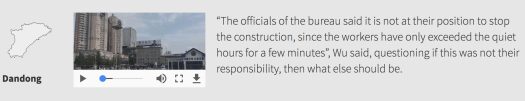
In the “City Profiles of Soundscapes”, we invited our friends in different cities, filming in different time and spots to record the environmental noise. Along with the interviewees’ narratives, we inserted the inline soundscape of the corresponding city.
Example html code styled by Bootstrap “grid system”:

Others soundscapes are assembled as a gallery shown in the end of the section in order to give more sense that “noises are almost anywhere and anytime”.
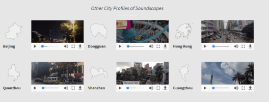
The abovementioned video embedding can be achieved just by today’s HTML and web browsers. And each video is also labelled with the geographic polygon of the city (map polygon from ECharts map). But in here no value is passed into the polygons so that the color remains plain just for shape identity purpose.
Lessons learned:
Interactive component is not a must. With all the excitement learning how to chart interactively, we are prone to abuse interactive charting and neglect pitfalls such as not labelling actual data (if necessary) and ambiguous coloring.
Keeping overall consistency but let the emphasis stand out. The project layout looks better for us compared with our previous work since the colors were kept consistent over the page even though many tools and libraries were used. Also, in visuals, this principle ensures that a point can be raised if a different color is picked for emphasis purpose.
For novice coders, debugging and getting the code work take time, not to say picking up new tools. From team-up to submission, the project span lasted for three months’ time (May to August). The first two months were for exploring topics and broad discussions. Our topic was finalised in August and hands-on work bagan. One person in our team was mainly responsible for the writing part, and two of us spent two weeks on coding.
One coder worked on the “Adversity” and “Soundscapes” while the other worked on web page building and charting. In estimation, we spent roughly 4 – 5 hours averagely per day in this two weeks. Tasks were carried out in parallel, but during the development process, we cross-checked others’ product. Yet not all the efforts are equally reflected in the final product, say the “Adversity” part, before we could pick AngularJS for a simple and decent solution, trying out tools/libraries took us one week’s time. And in “Compliance Rate” plotting, even general ECharts functions were introduced, figuring out how to plot shapes on map also took some time. For other parts, each took for one day or two. Overall, within only two weeks’ time, we had to, to a large extend, rely on acquired tools.
Project link: https://juliannawqy.github.io/urbannoise/
Project repo: https://github.com/JuliannaWQY/urbannoise
——-
Author: Julianna Wu, Roy Tang

Picking up AngularJS is such an endeavour! It will be better to further leverage the two-way model binding capability.
LikeLike