• Home
  • Event
  • Article
    • Gallery
    • Opinion
    • Resources
  • About
    • Founding Members
    • Steering Committee
    • Executive Officers
  • Newsletter

The Data & News Society

~ news/numbers; stats/stories

The Data & News Society

Author Archives: Roy Tang

[Tools] Online Verification Tools – Notes from Google @ GEN 2018

07 Thursday Jun 2018

Posted by Roy Tang in Article, Resources, Tool

≈ Leave a comment

At this year’s GEN (Global Editors Network) summit, Google News Initiative shared their notes regarding data journalism resources, particularly for investigative research and verification by online forensics. Here are some excerpts and we get a copy from Google News Lab, which you may find the complete notes attached at the end.

Research Tools

  • Google Public Data Explorer provides public data and forecasts from a range of international organizations and academic institutions. Visualized data are ready to interpret.
  • Google Trends compares search terms in a country and timeframe of your choice.

Verification Tools

  • Google Reverse Image Search & tineye.com & RevEye Reverse Image Search– verify the source or authenticity of images.
  • Storyful Multisearch – search via multiple social media platform at once.
  • Picodash – search for relevant hashtags on Instagram.
  • Who.Is – find out who owns a website.
  • YouTube Data Viewer – extract YouTube video metadata.
  • Frame by Frame – examine a video frame by frame.
  • GeoSearchTool – search tagged video content by location and timeframe.
  • WayBack – website screenshots archive.
  • SunCal.net – verify sunlights in images and videos.

Find more on data journalism training and multimedia toolsets below:

Q2 2018_ Workshop Notes 2018

轉載:如何標準化數據可視化之「美」?

12 Monday Feb 2018

Posted by Roy Tang in Article, general

≈ Leave a comment

Tags

#GIJN, Data Visualization, repost

轉載自 全球深度報導網 Repost from Global Investigative Journalism Network (GIJN)

Original Article(本文由簡體中文轉爲繁體中文)

媒體在數字化轉型中,越來越多地用數據可視化作為呈現方式。但許多可視化的作品只是追求形式上的美感,沒有實現數據可視化真正的功能:清晰有效地傳達信息,使讀者更形象地理解數字背後的含義。媒體推出的可視化新聞良莠不齊,水準忽上忽下,卻少有懂行的同行或讀者給予反饋。本週的數據新聞給讀者介紹由Perceptual Edge網站創始人、信息視覺化專家Stephen Few提出的一個標準化衡量規則,評價可視化是否達到了必要的效果。

Few認為,標準化的規則能讓大眾針對同一個方面給予評價,而不只再用空泛的語言描述一些模糊的印象。他認為,可視化的效果分為兩大類,分別是信息豐富性(Informative)和情緒感染力(Emotive)。前者考量的是數據可視化能讓讀者接收到多少信息,後者則衡量能否讓讀者產生一定的情緒反饋。在這兩大類之下,還有七個細分的小標準。信息豐富性涵蓋了五個維度:實用性、完整性、讀者接受度、真實性和直觀性。情緒感染力有兩層含義:一個是美感,另一個是用戶參與度。

Continue reading →

Tableau Student Viz Assignment Contest (Jan 8 – May 29, 2018)

03 Saturday Feb 2018

Posted by Roy Tang in Announcements

≈ Leave a comment

Tags

#Contest, Data Visualization, Tableau

Just created a visual for an assignment? Turn it into an awarding winning work by submitting it to the Tableau Student Vis Assignment Contest (Round II 2018)!

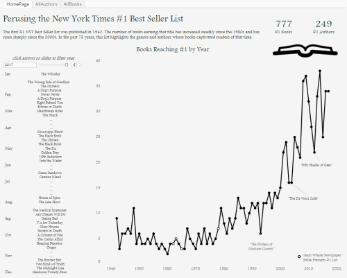
perusingnytimes

(Round I First PlaceWinner, Perusing the New York Times #1 Best Seller List)

Entry Eligibility:

  • Visuals should be created in Tableau, within the period of Jan 8 – May 29, 2018.
  • Participants should be currently enrolled in a degree-granting program.
  • Dataset used should publicly accessible.
  • Submit your work by publishing your visual to your Tableau Public profile

Continue reading →

Create Simple Filled Map (HK) in Tableau

02 Friday Feb 2018

Posted by Roy Tang in Tool, Tutorial

≈ 3 Comments

Tags

Excel, HK Fill Map, Tableau

Creating a filled map using JavaScript libraries might take you much time to get it work. This tutorial demonstrates how data visualization tool Tableau provide a decent and handy solution (*Note: Hong Kong Map feature is only available after version 10).

The final product can be found here: https://public.tableau.com/profile/roy.tang#!/vizhome/SimpleFilledMap/Dashboard1

Continue reading →

Tech Review of Urban Noise Project

03 Wednesday Jan 2018

Posted by Roy Tang in Gallery, Tutorial

≈ 1 Comment

Tags

angularjs, bootstrap, echarts, javascript

The project of Urban Noise is a interactive report concerning the urban noise issue in China, presented as a single web-page hosted on Github and integrated with multimedia attempts to visualize information. The team consisted of three journalism students and the production period took for around two weeks. This article is a brief tech review of the Urban Noise project, walking through how it was built up and what tools were used.

Continue reading →

Top Posts & Pages

  • The International Fur Trade: Data and Measurements
  • Create Simple Filled Map (HK) in Tableau
  • At a glance: Hong Kong poverty situation
  • Recap of SCMP infographic designers’ guest lecture in HKDI
  • The effectiveness of Hong Kong public libraries is diminishing

Recent Posts

  • A dossier of data journalism teaching strategies: Words from journalism educators worldwide
  • “中国数据可视化大赛”创作者专访:数据“几人行”
  • “Whoah, wait a minute, every reporter needs to be a data reporter”: Conversations with two generations of data journalists at the Los Angeles Times
  • Aaron Mendelson: Would numbers work with radio?
  • 首届“中国数据可视化大赛”启动-数据中的宏观和微观世界
  • Job Opportunity: Market Information Specialist at Unum Networks

Recent Comments

A quick video I made… on New towns fail to be self-cont…
Erin Chan on Create Simple Filled Map (HK)…
National Congress: s… on “Big Data” Tells Y…
Pili Hu on Data News of the Week | Gender…
Pili Hu on Key Takes from Jessica Lo…

Archives

  • August 2019
  • June 2019
  • April 2019
  • March 2019
  • February 2019
  • December 2018
  • November 2018
  • October 2018
  • September 2018
  • June 2018
  • May 2018
  • April 2018
  • March 2018
  • February 2018
  • January 2018
  • December 2017
  • November 2017
  • October 2017
  • September 2017
  • August 2017
  • May 2017
  • April 2017
  • March 2017
  • February 2017
  • January 2017
  • December 2016
  • November 2016
  • October 2016
  • September 2016
  • August 2016
  • July 2016
  • June 2016
  • May 2016
  • April 2016
  • March 2016
  • February 2016
  • January 2016
  • December 2015
  • November 2015

Meta

  • Register
  • Log in
  • Entries feed
  • Comments feed
  • WordPress.com

Recent Posts

  • A dossier of data journalism teaching strategies: Words from journalism educators worldwide
  • “中国数据可视化大赛”创作者专访:数据“几人行”
  • “Whoah, wait a minute, every reporter needs to be a data reporter”: Conversations with two generations of data journalists at the Los Angeles Times
  • Aaron Mendelson: Would numbers work with radio?
  • 首届“中国数据可视化大赛”启动-数据中的宏观和微观世界

Recent Comments

A quick video I made… on New towns fail to be self-cont…
Erin Chan on Create Simple Filled Map (HK)…
National Congress: s… on “Big Data” Tells Y…
Pili Hu on Data News of the Week | Gender…
Pili Hu on Key Takes from Jessica Lo…

Archives

  • August 2019
  • June 2019
  • April 2019
  • March 2019
  • February 2019
  • December 2018
  • November 2018
  • October 2018
  • September 2018
  • June 2018
  • May 2018
  • April 2018
  • March 2018
  • February 2018
  • January 2018
  • December 2017
  • November 2017
  • October 2017
  • September 2017
  • August 2017
  • May 2017
  • April 2017
  • March 2017
  • February 2017
  • January 2017
  • December 2016
  • November 2016
  • October 2016
  • September 2016
  • August 2016
  • July 2016
  • June 2016
  • May 2016
  • April 2016
  • March 2016
  • February 2016
  • January 2016
  • December 2015
  • November 2015

Categories

  • Announcement
  • Announcements
  • Article
  • Book
  • Colloquium
  • comment
  • Event
  • Field Trip
  • Gallery
  • general
  • news story
  • Open Lecture
  • Opinion
  • Resources
  • Tool
  • Tutorial
  • Uncategorized

Meta

  • Register
  • Log in
  • Entries feed
  • Comments feed
  • WordPress.com

Blog at WordPress.com.

  • Follow Following
    • The Data & News Society
    • Already have a WordPress.com account? Log in now.
    • The Data & News Society
    • Customize
    • Follow Following
    • Sign up
    • Log in
    • Report this content
    • View site in Reader
    • Manage subscriptions
    • Collapse this bar
 

Loading Comments...