
There were more than four months after the 2017 Las Vegas shooting, which is the deadliest mass shooting* committed by an individual of the States. As the largest gun-holding ratio (per capita) country around the world, USA has long been debating the gun control, yet, no consensus has been able to achieve. That’s also why media play a huge role in formulating the public debate and policy-making of gun control. We will discuss the two following reports by BBC (America’s gun culture in 10 charts) and The Telegraph (One mass shooting every day: Seven facts about gun violence in America) to illustrate the strengths and limitations of media coverage on the gun control.
*Mass shooting: When an attacker killed three or more victims in an indiscriminate rampage. Before 2013, the number was four.
1. Graphs
1.1 America’s mass shootings hotspots graph
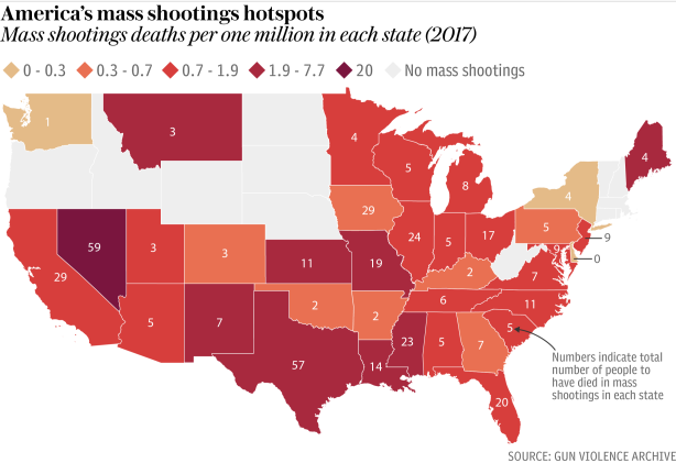
This chart from One mass shooting every day: Seven facts about gun violence in America shows the number of people dying in mass shootings per one million in each state. It is illustrated that most of the states have mass shooting deaths, of which Nevada and Texas have the highest two counts. Meanwhile, several states in the north have no victims of mass shootings so far. Apart from marking the numbers of deaths on the map, the casualty level is also indicated by the degree of red shades, which directly tells the situation and contrast between states.
1.2 Guns per 100 people 2007 vs mass shootings per million people (2000-14)
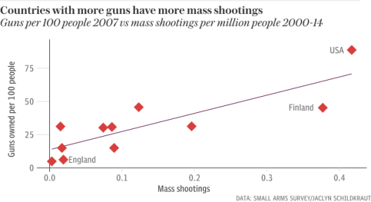
In this chart, the vertical axis represents the number of guns owned per 100 people, and the horizontal axis represents the number of mass shootings. This chart shows the correlation between two variables in different countries. Through this kind of form, we can simply know that there is a positive correlation between this two variables. If there are more countries to be included, it will be better.
1.3 Price of a gun in the US
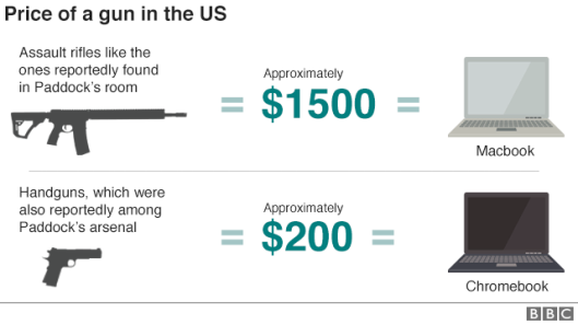
This chart gives us a direct impression that how much a gun costs by showing the comparison of guns and laptops.
1.4
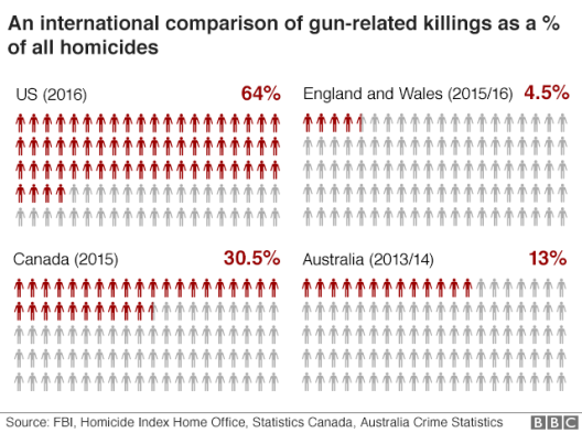
The chart indicates a proportion of gun-related killings among all homicides in different countries. The reporter tends to demonstrate that the US has a higher proportion than other countries. The usage of red and blank humanoid to present the proportion is clear and intuitive. However, the statistics are not from the same year, which makes the fact less convincing.
1.5 Contrast of two similar graphs
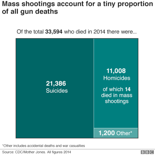
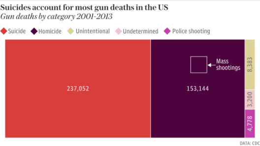
Both of the reports use this kind of chart to show different categories of gun deaths. We can get the information that the number of suicides is higher than that of homicides. At the same time, the chart in One mass shooting every day: Seven facts about gun violence in America is more thorough than the other one. We can also know that the mass shooting is only a small part of gun-related homicides. America’s gun violence is truly far more than mass shootings.
2. Text
The use of words in both articles are easy to understand and able to help readers to comprehend the charts. However, they were both too ambitious in explaining multiple arguments. The following will compare the common arguments in two publications.
Firstly, in the “America’s gun culture in 10 charts”, it not only discusses the mass shooting issues in America, also compares with other countries. The graphs below can inform readers about the context of the stories effectively. But if we look at the two arguments related with the graphs that the text should be combined in one paragraph that since the US has the highest average number of guns so that the probability of gun-related killings is highest.
For “One mass shooting every day”, the text is much better than the above one, which shows, “Higher rates of gun ownership correlate strongly with occurrences of mass shootings with the US emerging at the top of tree when it came to mass shootings”. Besides, the dot chart includes guns per 100 people and mass shootings per million people that let reader simply know the US has the highest rate.
Secondly, both two articles are described in detail that mass shootings account for a tiny proportion of all gun deaths.
“In this context, mass shootings make up a comparatively small proportion of overall gun deaths in the US, accounting for around three percent of homicides in 2017 so far according to the Gun Violence Archive”, according to “One mass shooting every day”. The different colors with multiple category legends help readers clearly identify statistics.
“The overall number of people killed in mass shootings each year represents only a tiny percentage of the total number”, said in “America’s gun culture in 10 charts”. However, the statistics are only in 2014 and it would be better if shows a larger range like the above graph.
Thirdly, the debate over gun rights and restrictions part in two articles are different.
The “One mass shooting everyday” one puts more focus on the data visuals and does not have long trunks of text that looks more closely.
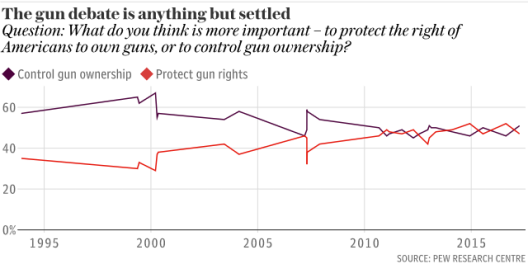
Additionally, “America’s gun culture in 10 charts” divides the graph into two parts, “Who supports gun control?” and “Who opposes gun control?”, seem confusing. One includes two graphs show three different public opinions and policy proposals of Republicans and Democrats, the other mentions the National Rifle Association campaigns suddenly. Inform readers more details are interesting, but the long text may lead to complex the analysis.
3. Interaction between the visual elements and text
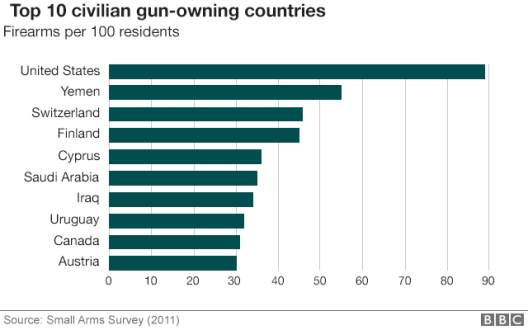
Take America’s gun culture in 10 charts as an example, each table is followed by a marked section. For instance, when mentioning the comparison among different gun-owning countries, there should be a bar chart as liked the one produced by BBC. There’s a close connection. If the editor just puts those figures down, the readers will lose interest.
Therefore, there’s no exact number shown in the section. And the main idea that the United States has the highest civilian gun-owning ratio is adequately revealed.
From the above, we can see that in visualizing report, the characters are to support.
4. Conclusion
Compared with other gun-owning countries, it’s more urgent to find the balance point of fire cases rate and gun-holding ratio. When America’s gun culture in 10 charts combines the report with more data charts, as a reader, more information can be achieved in a short time.
One mass shooting every day is conducted more traditionally. However, the “seven facts” are also conveyed to readers in extenso. So the report is supposed to be an effective one.
On the whole, when we need to present a large number of statistics in our news report, one of the best ways is to visualize the data.
5. Another case study (Updated on 9 Feb)
A report from New York Times (How to prevent gun deaths? Where experts and the public agree)
This report uses texts and charts as main part to show opinions of both experts and the public on methods of preventing gun deaths.
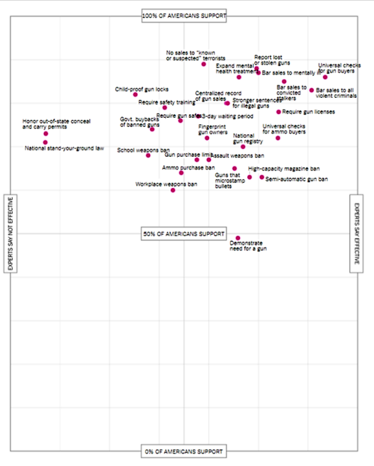
First, for the chart part, it uses a total chart and four branch chart to show the opinion of experts and the public. In the total chart, the vertical axis represents the extent of the public supporting and the horizontal axis represents the effectiveness of the ideas according to experts. From this chart, we can directly get the information that no matter the idea is effective or not, most of the gun control ideas are favored by more than half of the American registered citizens. What’s more, ideas which are popular and effective appear on the upper-right and those less popular and less effective measures fall down and to the left. By this way, readers can check each of the measures quickly and clearly get its advantage and disadvantage.
The other four charts are the branches of the first one. They show Trump’s supporting measures, reducing mass shootings measures, law enforcement needed measures and academics supporting measures clearly through this 4 charts.
Besides, the text of this report is partially academic and professional, which is convincing and reliable for the readers. It also helps explain and supplement the charts’ content, which gives readers more detailed information.
Author/ Gu Lin, Liu Xiaohan and Wang Jiachen ( JOUR2106 Data Visualisation (2018) – Group 2 )
Editor/ Jessie Pang
Data News of the Week (DNW) is a weekly issue of news summaries hand picked by our editors. It features a GLOCAL (global+local) perspective for the topic of concern. It tracks the latest developments from the industry and academics for methodology, tools, datasets and news agenda.

This article from Five Thirty Eight is worth mentioning: https://fivethirtyeight.com/features/why-dozens-of-mass-shootings-didnt-change-americans-minds-on-guns/ . Although it does not directly include data and charts, the opposite of Five Thirty Eight’s tradition of being one top data journalism site, the pointers are well researched and bespoked. It’s worth a whole day’s reading of this issue.
LikeLike