• Home
  • Event
  • Article
    • Gallery
    • Opinion
    • Resources
  • About
    • Founding Members
    • Steering Committee
    • Executive Officers
  • Newsletter

The Data & News Society

~ news/numbers; stats/stories

The Data & News Society

Tag Archives: Data Visualization

Data & News Salon #1 | Digital News and Interactive Reporting Projects from Taiwan Reporter

27 Tuesday Mar 2018

Posted by Bobo Wei in Announcements, Colloquium, Event

≈ Leave a comment

Tags

Data Journalism, Data Vis, Data Visualization, DNS

《報導者》數位專案與互動式新聞

Digital News and Interactive Reporting Projects from
Taiwan Reporter

Time: 12/4/2018 (Thur), 2:45-3:45pm

Venue: CVA203, HKBU

Speakers: 陳貞樺(Mimi CHEN) & 黃禹禛 (Yu Chen HUANG)

Language: Mandarin | 國語

Register Here

Welcome to join us!
1522139020(1)

Continue reading →

Analyze tracking errors between ETF and stock market index in the last decade

26 Monday Mar 2018

Posted by chico_x in news story, Tutorial

≈ Leave a comment

Tags

COMM7780/JOUR7280, Data Visualization, Finance, Fund, Python

5571521786922_.pic_hd.jpgSummary: In this article, under the context of Hong Kong’s Mandatory Provident Fund scheme (MPF), we find that some Exchange Traded Fund (ETF) occupy large holdings in a particular MPF fund. By calculating the tracking errors over the past ten years, the year of 2008 stands out with the highest tracking error, which corresponds with the global financial crisis. In other years with more stable stock markets, ETF performs relatively well. We also calculate returns between two ETFs and the indexes they track respectively; the results turn out to be different.

We use Python as a calculator, rely on pandas to read csv files downloaded from Yahoo Finance, and time series to present data in the form of charts.

Background

Hong Kong has a rapidly aging society. According to the Population Projections released by Census and Statistics Department, HK is expected to have a third of its population that aged 65 and above by the mid of 21st century. There is a growing concern over the issue of social security especially for the elderly, since the burden for the employed population in the future to take care of the retirees will be unbearable.

Continue reading →

轉載:如何標準化數據可視化之「美」?

12 Monday Feb 2018

Posted by Roy Tang in Article, general

≈ Leave a comment

Tags

#GIJN, Data Visualization, repost

轉載自 全球深度報導網 Repost from Global Investigative Journalism Network (GIJN)

Original Article(本文由簡體中文轉爲繁體中文)

媒體在數字化轉型中,越來越多地用數據可視化作為呈現方式。但許多可視化的作品只是追求形式上的美感,沒有實現數據可視化真正的功能:清晰有效地傳達信息,使讀者更形象地理解數字背後的含義。媒體推出的可視化新聞良莠不齊,水準忽上忽下,卻少有懂行的同行或讀者給予反饋。本週的數據新聞給讀者介紹由Perceptual Edge網站創始人、信息視覺化專家Stephen Few提出的一個標準化衡量規則,評價可視化是否達到了必要的效果。

Few認為,標準化的規則能讓大眾針對同一個方面給予評價,而不只再用空泛的語言描述一些模糊的印象。他認為,可視化的效果分為兩大類,分別是信息豐富性(Informative)和情緒感染力(Emotive)。前者考量的是數據可視化能讓讀者接收到多少信息,後者則衡量能否讓讀者產生一定的情緒反饋。在這兩大類之下,還有七個細分的小標準。信息豐富性涵蓋了五個維度:實用性、完整性、讀者接受度、真實性和直觀性。情緒感染力有兩層含義:一個是美感,另一個是用戶參與度。

Continue reading →

Data News of the Week | U.S. Gun Control Debate and the Media

08 Thursday Feb 2018

Posted by Lisa in Article, Resources

≈ 1 Comment

Tags

data analysis, data cases, Data Visualization, DNW, Gun Control, USA

There were more than four months after the 2017 Las Vegas shooting, which is the deadliest mass shooting* committed by an individual of the States. As the largest gun-holding ratio (per capita) country around the world, USA has long been debating the gun control, yet, no consensus has been able to achieve. That’s also why media play a huge role in formulating the public debate and policy-making of gun control. We will discuss the two following reports by BBC (America’s gun culture in 10 charts) and The Telegraph (One mass shooting every day: Seven facts about gun violence in America) to illustrate the strengths and limitations of media coverage on the gun control.

*Mass shooting: When an attacker killed three or more victims in an indiscriminate rampage. Before 2013, the number was four. Continue reading →

Recap of SCMP infographic designers’ guest lecture in HKDI

06 Tuesday Feb 2018

Posted by jessiepyt in Event, Open Lecture, Resources

≈ Leave a comment

Tags

Data Journalism, Data Visualization, Infographics, New Media, Open Lecture

picture 2

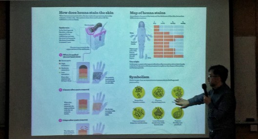
Marcelo Duhalde showcases his research work behind the infographics. Photo: Zhang Ruirong

The first principle of making infographics is clearness because infographics are created for sharing, said Marcelo Duhalde, an infographic designer from SCMP as well as his colleague Marco Hernandez, invited by Hong Kong Design Institute on Feb 6.

Continue reading →

Tableau Student Viz Assignment Contest (Jan 8 – May 29, 2018)

03 Saturday Feb 2018

Posted by Roy Tang in Announcements

≈ Leave a comment

Tags

#Contest, Data Visualization, Tableau

Just created a visual for an assignment? Turn it into an awarding winning work by submitting it to the Tableau Student Vis Assignment Contest (Round II 2018)!

perusingnytimes

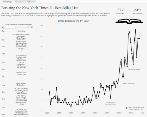
(Round I First PlaceWinner, Perusing the New York Times #1 Best Seller List)

Entry Eligibility:

  • Visuals should be created in Tableau, within the period of Jan 8 – May 29, 2018.
  • Participants should be currently enrolled in a degree-granting program.
  • Dataset used should publicly accessible.
  • Submit your work by publishing your visual to your Tableau Public profile

Continue reading →

Data News of the Week | Trump Lies and His Job Promises

01 Thursday Feb 2018

Posted by Erin Chan in Article, Resources

≈ 3 Comments

Tags

data, Data Visualization, DNW, Trump

It has been more than a year under Donald Trump’s administration. Trump has made a lot of groundless claims and job promises which happen arbitrarily. Some newsagents keep a record of it and visualize the frequency. To criticise the act of the president in a more grounded way, The New York Times compares the lies frequency between Trump’s and the former president Barack Obama. We also dug deeper into one of his promises in his election platform which is job creation and employment enhancement. From which, we adopted a project from ProPublica. The following will discuss the visualization, the use of words and the effects of the two projects. 

Continue reading →

Data News of the Week | Visualising the Blockchain

15 Monday Jan 2018

Posted by Pili Hu in news story, Resources

≈ Leave a comment

Tags

Bitcoin, Blockchain, Crypto Currency, Data Visualization, DNW, Finance, Infographics

The Rise and Rise of ICO in late 2017

If you still don’t know what is “blockchain” or what is “bitcoin”, The recent work from Max Galka will assure you this is the high time to do some self-study, or you will miss the birth time of “another Internet”. The idea of ICO, Initial Coin/Chain Offering, is an analogy of IPO. With the inception of “smart contract” capability, fundraising, a process to exchange currency to certificate, can be done in a distributed manner. The “currency” in the chain world can be Ethereum, NEO, BitCoin, … The “certificate” in the chain world is called “token” so the ICO process is also referred to as “token sale”. The convenience of ICO gains rapid growth with crazy capitals pouring into this field. Just check out this interactive/ animated token sale history.

Screenshot: The ICO Market Cap to date (Nov 2017)

Continue reading →

Top Posts & Pages

  • Create Simple Filled Map (HK) in Tableau
  • Hong Kong’s grave marine plastic pollution long left untackled, Greenpeace statistics show
  • Financial Times Chinese Network editor-in-chief joins colloquium
  • Call for Entries! The 2nd University Data Journalism Competition
  • New towns fail to be self-contained as planned, government data shows

Recent Posts

  • A dossier of data journalism teaching strategies: Words from journalism educators worldwide
  • “中国数据可视化大赛”创作者专访:数据“几人行”
  • “Whoah, wait a minute, every reporter needs to be a data reporter”: Conversations with two generations of data journalists at the Los Angeles Times
  • Aaron Mendelson: Would numbers work with radio?
  • 首届“中国数据可视化大赛”启动-数据中的宏观和微观世界
  • Job Opportunity: Market Information Specialist at Unum Networks

Recent Comments

A quick video I made… on New towns fail to be self-cont…
Erin Chan on Create Simple Filled Map (HK)…
National Congress: s… on “Big Data” Tells Y…
Pili Hu on Data News of the Week | Gender…
Pili Hu on Key Takes from Jessica Lo…

Archives

  • August 2019
  • June 2019
  • April 2019
  • March 2019
  • February 2019
  • December 2018
  • November 2018
  • October 2018
  • September 2018
  • June 2018
  • May 2018
  • April 2018
  • March 2018
  • February 2018
  • January 2018
  • December 2017
  • November 2017
  • October 2017
  • September 2017
  • August 2017
  • May 2017
  • April 2017
  • March 2017
  • February 2017
  • January 2017
  • December 2016
  • November 2016
  • October 2016
  • September 2016
  • August 2016
  • July 2016
  • June 2016
  • May 2016
  • April 2016
  • March 2016
  • February 2016
  • January 2016
  • December 2015
  • November 2015

Meta

  • Register
  • Log in
  • Entries feed
  • Comments feed
  • WordPress.com

Recent Posts

  • A dossier of data journalism teaching strategies: Words from journalism educators worldwide
  • “中国数据可视化大赛”创作者专访:数据“几人行”
  • “Whoah, wait a minute, every reporter needs to be a data reporter”: Conversations with two generations of data journalists at the Los Angeles Times
  • Aaron Mendelson: Would numbers work with radio?
  • 首届“中国数据可视化大赛”启动-数据中的宏观和微观世界

Recent Comments

A quick video I made… on New towns fail to be self-cont…
Erin Chan on Create Simple Filled Map (HK)…
National Congress: s… on “Big Data” Tells Y…
Pili Hu on Data News of the Week | Gender…
Pili Hu on Key Takes from Jessica Lo…

Archives

  • August 2019
  • June 2019
  • April 2019
  • March 2019
  • February 2019
  • December 2018
  • November 2018
  • October 2018
  • September 2018
  • June 2018
  • May 2018
  • April 2018
  • March 2018
  • February 2018
  • January 2018
  • December 2017
  • November 2017
  • October 2017
  • September 2017
  • August 2017
  • May 2017
  • April 2017
  • March 2017
  • February 2017
  • January 2017
  • December 2016
  • November 2016
  • October 2016
  • September 2016
  • August 2016
  • July 2016
  • June 2016
  • May 2016
  • April 2016
  • March 2016
  • February 2016
  • January 2016
  • December 2015
  • November 2015

Categories

  • Announcement
  • Announcements
  • Article
  • Book
  • Colloquium
  • comment
  • Event
  • Field Trip
  • Gallery
  • general
  • news story
  • Open Lecture
  • Opinion
  • Resources
  • Tool
  • Tutorial
  • Uncategorized

Meta

  • Register
  • Log in
  • Entries feed
  • Comments feed
  • WordPress.com

Blog at WordPress.com.

  • Follow Following
    • The Data & News Society
    • Already have a WordPress.com account? Log in now.
    • The Data & News Society
    • Customize
    • Follow Following
    • Sign up
    • Log in
    • Report this content
    • View site in Reader
    • Manage subscriptions
    • Collapse this bar
 

Loading Comments...