Tags
(This is a repost from STUDENTS’ FINAL PROJECTS OF THE DATA VISUALIZATION FOR NEWS @ HKBU Spring 2017,click the link to read the full page: Hong Kong Craft Beer)


29 Saturday Apr 2017
Tags
(This is a repost from STUDENTS’ FINAL PROJECTS OF THE DATA VISUALIZATION FOR NEWS @ HKBU Spring 2017,click the link to read the full page: Hong Kong Craft Beer)
29 Saturday Apr 2017
Posted in Gallery, news story, Tool
(This is a repost from STUDENTS’ FINAL PROJECTS OF THE DATA VISUALIZATION FOR NEWS @ HKBU Spring 2017,click the link to read the full page: Observation of secondary schools in HK/十八區中學面面觀)

這是數據新聞專業學生2017年的作品,三位同學以網站的形式透過數據新聞討論了香港十八區的中學的教育問題。有互動設計【測試你對18區中學的認識】,也有以表格、地圖模式呈現學校的情況。
“There are a lot of myths about secondary schools in Hong Kong. The best secondary schools (Band 1 schools) have the oldest history and are located in the richest districts. People also observe that schools with a particular religious background are very prominent in Hong Kong. Are all these true? We collected data showing all secondary schools in Hong Kong and present to you a comprehensive analysis to solve your questions.”
Members : Jam LEE Yee Man, John POON Tsz Fung, Alison LI Pui Ying
Mentor : Alex Koo
20 Thursday Apr 2017
Tags
Do you know what is “Git”, “Geocoding”, or other data phrases mean?
Few data journalists launched a brand-new tool called The data journalism dictionary might help you.
Please check: Journocode Data Journalism Dictionary

06 Thursday Apr 2017
Posted in news story, Resources, Tool
Tags
Data visualization sometimes can be very similar, data news use bar charts and lines to show the details. From this articles we can have another thought about using easy hand drawing to enhance the reading experience:
1.Hand Drawing
Mona Chalabi is data editor at Guardian US. She previously worked at FiveThirtyEight, the Bank of England, the Economist Intelligence Unit, Transparency International and the International Organisation for Migration.
20 Monday Mar 2017
Posted in general, news story, Opinion
Tags
原文转载自微信公众号刺猬公社,作者贾宸琰,原文请点:哥大数据新闻专业毕业后,为什么我最后选择做多媒体?
导读
李沁灵,毕业于哥伦比亚大学新闻学院数据新闻方向,现于IBT Media纽约总部担任Multimedia Producer(多媒体制作人),制作过批评特朗普网络政策的多媒体作品《Net Neutrality》。此外,李沁灵曾经制作了《基督教科学箴言报》封面报道视频《2016:The Year of Disruption》等多媒体作品。
“为什么我学了数据,最后没去编程,却成为了多媒体制作人?”
14 Tuesday Mar 2017
Posted in general, news story, Opinion
Tags
Since Trump became the President of the U.S., his Twitter also became the main source of the news.
Twitter is still banned in mainland China, however, can not stop the Chinese internet users to follow and make fun of it.
Here is a Data News of Trump’s Twitter from FT.Chinese.com
(This is a repost from FT.Chinese.com by Silva Shih, click the link to read the original:
14 Tuesday Mar 2017
Posted in general, news story, Opinion
Tags
data, Data Journalism, DNW, news, Trump
Since Trump became the President of the U.S., his Twitter also became the main source of the news.
Twitter is still banned in mainland China, however, can not stop the Chinese internet users to follow and make fun of it.
Here is a Data News of Trump’s Twitter from FT.Chinese.com
(This is a repost from FT.Chinese.com by Silva Shih, click the link to read the original:
28 Tuesday Feb 2017
Tags
Everyone is talking about America’s politics, and the The New Youk Times used cubes to visualize the data and make the stories more fun to read, you can easily tell from Economy(blue), Domestic Issues(yellow) or International Issues(red): Continue reading
28 Tuesday Feb 2017
Tags
Everyone is talking about America’s politics, and the The New Youk Times used cubes to visualize the data and make the stories more fun to read, you can easily tell from Economy(blue), Domestic Issues(yellow) or International Issues(red): Continue reading
21 Tuesday Feb 2017
Posted in Colloquium, Event, general, Opinion, Resources
Tags
At the first Data & News Society Colloquium of 2017, Jonathan Soma, from Columbia Journalism School, shared his ideas on Data and Visual Design in Journalism on Feb.20th.
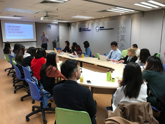
(Photo by Bobo WEI)
