• Home
  • Event
  • Article
    • Gallery
    • Opinion
    • Resources
  • About
    • Founding Members
    • Steering Committee
    • Executive Officers
  • Newsletter

The Data & News Society

~ news/numbers; stats/stories

The Data & News Society

Tag Archives: Tableau

Tableau Student Viz Assignment Contest (Jan 8 – May 29, 2018)

03 Saturday Feb 2018

Posted by Roy Tang in Announcements

≈ Leave a comment

Tags

#Contest, Data Visualization, Tableau

Just created a visual for an assignment? Turn it into an awarding winning work by submitting it to the Tableau Student Vis Assignment Contest (Round II 2018)!

perusingnytimes

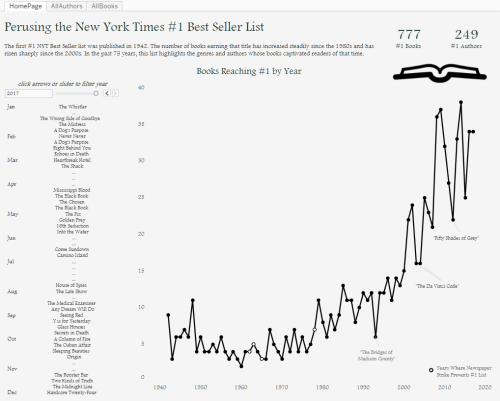
(Round I First PlaceWinner, Perusing the New York Times #1 Best Seller List)

Entry Eligibility:

  • Visuals should be created in Tableau, within the period of Jan 8 – May 29, 2018.
  • Participants should be currently enrolled in a degree-granting program.
  • Dataset used should publicly accessible.
  • Submit your work by publishing your visual to your Tableau Public profile

Continue reading →

Create Simple Filled Map (HK) in Tableau

02 Friday Feb 2018

Posted by Roy Tang in Tool, Tutorial

≈ 3 Comments

Tags

Excel, HK Fill Map, Tableau

Creating a filled map using JavaScript libraries might take you much time to get it work. This tutorial demonstrates how data visualization tool Tableau provide a decent and handy solution (*Note: Hong Kong Map feature is only available after version 10).

The final product can be found here: https://public.tableau.com/profile/roy.tang#!/vizhome/SimpleFilledMap/Dashboard1

Continue reading →

紙本書的年代過去了嗎?關於港人閱讀的四個疑問

17 Sunday Dec 2017

Posted by 17208505liang in Gallery, news story, Uncategorized

≈ Leave a comment

Tags

JOUR2076, Tableau

「人讀等身書,如將兵十萬。」近年,地鐵、馬路等公眾場合,隨處都能看見港人機不離手。有不少聲音說,手機的便利與普及令大眾大幅減少閱讀紙質出版物。香港人還願意捧起書本嗎?手機能否逐漸取代它們?

Continue reading →

食環街市買餸越來越貴,原因何在?

09 Saturday Dec 2017

Posted by Jennie Tang in Gallery

≈ Leave a comment

Tags

food, JOUR2076, price, Tableau, wet market


IMG_7954-468801756-1512641734158.jpg

媽媽常說我們「食米不知米貴」,我們也總不明白主婦們為什麼要為那「一個幾毫」而跨區買菜。事實上今時今日要在街市買一頓飯菜的材料貴了多少?不同地區的食材價格差異,又真的只有「一個幾毫」嗎?

比較2016年發表的街市食品價格統計及全港地區入息中位數,當中我們發現有收入與物價不衡現象,以沙田、大埔、元朗三區情況最為嚴重,物價升幅持續上漲,高於工資升幅。有街市檔主認為問題歸咎於休漁期及內地直銷菜,亦發現食環街市於十八區分佈與人口數量不均,以沙田及西貢區最嚴重。

記者:鄧綺婷   李慧盈   王嘉琛

Continue reading →

Coming Clean, what employers really want from domestic helpers

09 Saturday Dec 2017

Posted by laicelia304 in Gallery

≈ Leave a comment

Tags

domestic helper, JOUR2076, Tableau

By: Celia Lai, Winnie Ngai, James Allen, Ellen He

Domestic helpers are an integral part in Hong Kong. Since 1973, the Hong Kong government has allowed foreign nationals to come to Hong Kong to work as domestic helpers. With over 350,000 helpers in Hong Kong, many households choose to employ foreign domestic helpers to help with a number of tasks. This is beneficial for helpers from low-income countries or regions, who can work for a higher wage than they would normally get in their home country, and send money back to help their family live more comfortably.

Continue reading →

Embedding interactive rich media on WordPress

07 Tuesday Nov 2017

Posted by jadeimaginist in Tool, Tutorial

≈ 2 Comments

Tags

canva, Google Chart, infogram, Kumu, StoryMapJS, Tableau, TimelineJS

Source: Wiki Commons

There are a lot “one-click” tools available online that help you to create good visualisation and export to iframe for embedding into your site. Good use of those tools can better present your content to the readers. Note that the free version of WordPress hosted service does not allow embedding iframe, so they can only rely on shortcodes. For example, one can use is  to embed interactive charts generated from Google Sheets. See more options of available shortcodes for free version here

Data and News Society is operated on a paid plan so we installed the iframe plugin. This makes it possible to enable a wide range of 3rd party visualisation into your project. This tutorial is contributed by Jade Li to demo how to embed interactive content from several common tools. The general workflow is to first export the 3rd party project as iframe, find the URL in the src=”” section, and use  [ iframe src=”” ] to embed it into WordPress.

Continue reading →

利用Tableau的JOIN功能篩選完整數據片段

05 Sunday Nov 2017

Posted by zoyazhao in Resources, Tool

≈ Leave a comment

Tags

data analysis, JOIN, Tableau, waste

做數據新聞經常會需要處理大量缺失數據(Missing Data)。如果原始數據是一張二維表格,那麼這張表格中有很多「空洞」,我們常常希望過濾掉這些「空洞」,留下整行整列,以便在一個限定的範圍內,進行完整的分析工作。

本文來自同學Zoya的投稿,目的是用地圖展示各個國家市政垃圾收集的數量。原始數據來自UN Municipal Waste Collection Dataset,年份覆蓋並不完全(Missing Data)。爲了統一對比標準,項目最終選擇篩選出2002到2012年(共11年)均有數據的國家,再繪製地圖。本教程展示了兩種方法,均有值得借鑑的技巧。法一組合利用Excel、Open Refine、Tableau的基礎功能,最後使用Tableau的JOIN操作,實現了缺失數據的過濾。法二則針對本用例的特殊性,直接在Tableau內部完整整個數據流,用到了「# of Records」這個特殊的計算量。

1

圖:原始數據截圖

Continue reading →

Top Posts & Pages

  • Google Sheets 技巧總結
  • Create Simple Filled Map (HK) in Tableau
  • Hong Kong’s grave marine plastic pollution long left untackled, Greenpeace statistics show
  • 食環街市買餸越來越貴,原因何在?
  • 數據新聞的精選 Feed 列表

Recent Posts

  • A dossier of data journalism teaching strategies: Words from journalism educators worldwide
  • “中国数据可视化大赛”创作者专访:数据“几人行”
  • “Whoah, wait a minute, every reporter needs to be a data reporter”: Conversations with two generations of data journalists at the Los Angeles Times
  • Aaron Mendelson: Would numbers work with radio?
  • 首届“中国数据可视化大赛”启动-数据中的宏观和微观世界
  • Job Opportunity: Market Information Specialist at Unum Networks

Recent Comments

A quick video I made… on New towns fail to be self-cont…
Erin Chan on Create Simple Filled Map (HK)…
National Congress: s… on “Big Data” Tells Y…
Pili Hu on Data News of the Week | Gender…
Pili Hu on Key Takes from Jessica Lo…

Archives

  • August 2019
  • June 2019
  • April 2019
  • March 2019
  • February 2019
  • December 2018
  • November 2018
  • October 2018
  • September 2018
  • June 2018
  • May 2018
  • April 2018
  • March 2018
  • February 2018
  • January 2018
  • December 2017
  • November 2017
  • October 2017
  • September 2017
  • August 2017
  • May 2017
  • April 2017
  • March 2017
  • February 2017
  • January 2017
  • December 2016
  • November 2016
  • October 2016
  • September 2016
  • August 2016
  • July 2016
  • June 2016
  • May 2016
  • April 2016
  • March 2016
  • February 2016
  • January 2016
  • December 2015
  • November 2015

Meta

  • Register
  • Log in
  • Entries feed
  • Comments feed
  • WordPress.com

Recent Posts

  • A dossier of data journalism teaching strategies: Words from journalism educators worldwide
  • “中国数据可视化大赛”创作者专访:数据“几人行”
  • “Whoah, wait a minute, every reporter needs to be a data reporter”: Conversations with two generations of data journalists at the Los Angeles Times
  • Aaron Mendelson: Would numbers work with radio?
  • 首届“中国数据可视化大赛”启动-数据中的宏观和微观世界

Recent Comments

A quick video I made… on New towns fail to be self-cont…
Erin Chan on Create Simple Filled Map (HK)…
National Congress: s… on “Big Data” Tells Y…
Pili Hu on Data News of the Week | Gender…
Pili Hu on Key Takes from Jessica Lo…

Archives

  • August 2019
  • June 2019
  • April 2019
  • March 2019
  • February 2019
  • December 2018
  • November 2018
  • October 2018
  • September 2018
  • June 2018
  • May 2018
  • April 2018
  • March 2018
  • February 2018
  • January 2018
  • December 2017
  • November 2017
  • October 2017
  • September 2017
  • August 2017
  • May 2017
  • April 2017
  • March 2017
  • February 2017
  • January 2017
  • December 2016
  • November 2016
  • October 2016
  • September 2016
  • August 2016
  • July 2016
  • June 2016
  • May 2016
  • April 2016
  • March 2016
  • February 2016
  • January 2016
  • December 2015
  • November 2015

Categories

  • Announcement
  • Announcements
  • Article
  • Book
  • Colloquium
  • comment
  • Event
  • Field Trip
  • Gallery
  • general
  • news story
  • Open Lecture
  • Opinion
  • Resources
  • Tool
  • Tutorial
  • Uncategorized

Meta

  • Register
  • Log in
  • Entries feed
  • Comments feed
  • WordPress.com

Blog at WordPress.com.

Cancel