• Home
  • Event
  • Article
    • Gallery
    • Opinion
    • Resources
  • About
    • Founding Members
    • Steering Committee
    • Executive Officers
  • Newsletter

The Data & News Society

~ news/numbers; stats/stories

The Data & News Society

Category Archives: Resources

Data News of the Week: A World Defended and Invaded by Data – a Technical News Story Covering NSA Files Leak

08 Thursday Mar 2018

Posted by jessiepyt in Resources, Tutorial

≈ Leave a comment

Tags

DataNews, DNW, FilesLeak, NSA

Do you consider your personal information well protected? You use different passwords for different accounts, keep your social network activity private, even fake your profile on social media. Your efforts are probably in vain.

Everything you have done is under surveillance and your life pattern can even be figured out by people who are thousands of millions away from you. The government knows that you called Daisy three times in twenty-four hours, with one after midnight. You use Google Map in Central, Hong Kong at 2pm and your route is also recorded. You may wonder: I am just nobody. Why will somebody spare effort to analyze my data? In fact, you are somebody. Three degrees of separation points out that if you have 190 friends on Facebook, then after “three hops”, the network you can reach is even bigger than the population of Colorado.

Continue reading →

Data News of the Week | Gender Pay Gap: Why and How?

01 Thursday Mar 2018

Posted by harprrrr in Resources, Tutorial

≈ 1 Comment

Tags

data, data news, DNW, gender, gender gap, news game, pay gap

Professor Jordan Peterson has been the center of attention in last few weeks for participating in a number of debates regarding gender wage gap. Unlike the feminists calling for the reduction of discrimination over salary, he believes gender wage gap is an explainable consequence of multiple social factors rather than a problem caused by discrimination. Is he right? After all, why is there gender wage gap? Looking into 3 reports (Why is There a Gender Wage Gap – Our World in Data, Six Key Facts About the Gender Pay Gap – Our World in Data, Gender Pay Gap: the Day Women Start Working For Free – Washington Post) and a  published recently with analytics over statistics regarding gender wage gap will give us a thorough understanding of current gender wage gap. Continue reading →

Data News of the Week | What can we, the 20-year-old, do to change the world?

23 Friday Feb 2018

Posted by jessiepyt in Resources, Tutorial

≈ 1 Comment

Tags

data, data analysis, data cases, data collection, Data Journalism, Datamining, DNW, Heatmap, Strava

Nathan Ruser, a 20-year-old Australian National University student who is majoring in international security with a keen interest in cartography, discovered a fitness app had revealed the locations of secret military sites in Syria and elsewhere. He posted on Twitter about this, did not expect much response.

But the news ricocheted across the internet. Security experts said the Strave app’s “heat map” could be used by hostile entities glean valuable intelligence. The Pentagon said it was reviewing the situation.

How he found the news?

 “Whoever thought that operational security could be wrecked by a Fitbit?” Mr. Ruser, said in an interview with New York Times from Thailand, where he is spending part of the Australian summer break.

When he looked over Syria on Strava’s map — which is based on location data from millions of users, including military personnel, who share their exercise activity — the area “lit up with those U.S. bases,” he said.

Before publicly sharing his findings over the weekend, he discussed them in a private chat group on Twitter, made up of people interested in intelligence and security issues. “I know about two-thirds of what I know about the world from the group chats,” he said.

Continue reading →

農曆新年學習資料大禮包!Data Journalism Learning Tools

14 Wednesday Feb 2018

Posted by Bobo Wei in Book, Resources, Tool, Tutorial

≈ Leave a comment

Tags

data, Data Journalism, data science, Data Vis

農曆新年伊始,小編在此給各位愛學習的小夥伴推薦一些學習Data Journalism有用的線上課程,資料和工具。希望新的一年,大家學業進步!順順利利!(原文部分轉載自 initiumlab.com, 有部分編輯, 點擊查看更多: 學習資料清單)

  • 系列課程:從查找資料開始、學習解讀資料的意義、資料視覺化到用資料說故事。

1.Doing Journalism with Data: First Steps, Skills and Tools(課程在LEARNO.NET平台開放,一共5節,直接註冊,免費學習)

http://learno.net/courses/doing-journalism-with-data-first-steps-skills-and-tools

2.Data Exploration and Storytelling(數據大師Alberto Cairo & Heather Krause開設)

https://publicmediaalliance.org/free-online-course-data-exploration-storytelling/

Continue reading →

Data News of the Week | U.S. Gun Control Debate and the Media

08 Thursday Feb 2018

Posted by Lisa in Article, Resources

≈ 1 Comment

Tags

data analysis, data cases, Data Visualization, DNW, Gun Control, USA

There were more than four months after the 2017 Las Vegas shooting, which is the deadliest mass shooting* committed by an individual of the States. As the largest gun-holding ratio (per capita) country around the world, USA has long been debating the gun control, yet, no consensus has been able to achieve. That’s also why media play a huge role in formulating the public debate and policy-making of gun control. We will discuss the two following reports by BBC (America’s gun culture in 10 charts) and The Telegraph (One mass shooting every day: Seven facts about gun violence in America) to illustrate the strengths and limitations of media coverage on the gun control.

*Mass shooting: When an attacker killed three or more victims in an indiscriminate rampage. Before 2013, the number was four. Continue reading →

Recap of SCMP infographic designers’ guest lecture in HKDI

06 Tuesday Feb 2018

Posted by jessiepyt in Event, Open Lecture, Resources

≈ Leave a comment

Tags

Data Journalism, Data Visualization, Infographics, New Media, Open Lecture

picture 2

Marcelo Duhalde showcases his research work behind the infographics. Photo: Zhang Ruirong

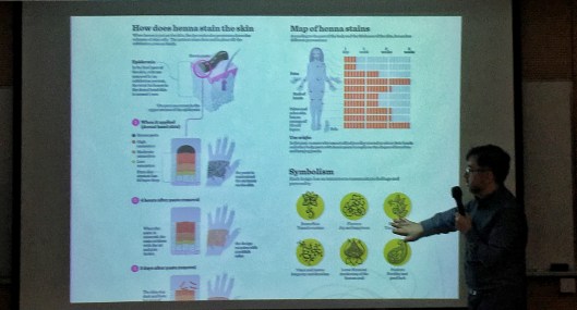
The first principle of making infographics is clearness because infographics are created for sharing, said Marcelo Duhalde, an infographic designer from SCMP as well as his colleague Marco Hernandez, invited by Hong Kong Design Institute on Feb 6.

Continue reading →

Data News of the Week | Trump Lies and His Job Promises

01 Thursday Feb 2018

Posted by Erin Chan in Article, Resources

≈ 3 Comments

Tags

data, Data Visualization, DNW, Trump

It has been more than a year under Donald Trump’s administration. Trump has made a lot of groundless claims and job promises which happen arbitrarily. Some newsagents keep a record of it and visualize the frequency. To criticise the act of the president in a more grounded way, The New York Times compares the lies frequency between Trump’s and the former president Barack Obama. We also dug deeper into one of his promises in his election platform which is job creation and employment enhancement. From which, we adopted a project from ProPublica. The following will discuss the visualization, the use of words and the effects of the two projects. 

Continue reading →

Data News of the Week | Visualising the Blockchain

15 Monday Jan 2018

Posted by Pili Hu in news story, Resources

≈ Leave a comment

Tags

Bitcoin, Blockchain, Crypto Currency, Data Visualization, DNW, Finance, Infographics

The Rise and Rise of ICO in late 2017

If you still don’t know what is “blockchain” or what is “bitcoin”, The recent work from Max Galka will assure you this is the high time to do some self-study, or you will miss the birth time of “another Internet”. The idea of ICO, Initial Coin/Chain Offering, is an analogy of IPO. With the inception of “smart contract” capability, fundraising, a process to exchange currency to certificate, can be done in a distributed manner. The “currency” in the chain world can be Ethereum, NEO, BitCoin, … The “certificate” in the chain world is called “token” so the ICO process is also referred to as “token sale”. The convenience of ICO gains rapid growth with crazy capitals pouring into this field. Just check out this interactive/ animated token sale history.

Screenshot: The ICO Market Cap to date (Nov 2017)

Continue reading →

My First Application of FOI in Hong Kong

13 Saturday Jan 2018

Posted by graceli618 in Resources, Tutorial

≈ 1 Comment

Tags

data collection, GIJC17, open data, open government

It was new for me when I heard anyone can acquire almost any data from HK government for legitimate reasons under that Code on Access to Information.

This code is a response to the notion of “FOI” (For Our Information; Freedom Of Information), which calls for citizens’ free access to government information so that the transparency of government management can be ensured and citizen rights can be protected.

According to Wiki, In 2006, nearly 70 countries went through relative legislation. Among these laws are USA’s FOIA (Freedom of Information Act) and, of course, Hong Kong’s Code on Access to information.

Despite the code in place, a practical question remains. Will those government officers fulfill their duty and do give reply to every single data request? So I decided to give a try on Accessinfo.hk.

Accessinfo.hk is a website positioned as a platform for citizens to post their information requests to authorities and receive feedback. It was initiated by a group of Open Data activist, including Guy Freeman, who is currently data scientist in HK01. The website publishes every question and answer to everyone, and, at the same time, monitors the process. Before localizing the Alaveteli system ( http://alaveteli.org/ ) to Hong Kong, its sister site WhatDoTheyKnow ( https://www.whatdotheyknow.com/ ) had already seen wide application in the United Kingdom.

accessinfo

Screenshot: accessinfo.hk

Continue reading →

Data News of the Week | US Tax Cuts and Jobs Act

05 Friday Jan 2018

Posted by Bobo Wei in general, news story, Resources

≈ 1 Comment

Tags

data, Data Journalism, Data Vis, DNW

On December 22, 2017, President Trump signed the Tax Cuts and Jobs Act. How does it matter to the companies and citizens?

Tax is one of the crucial parts of the country’s economic. Under the globalization, US tax policy might relevant to your life. The economic trends could affect you and the steps you might need to take so you can profit from it. Moreover, there are lots of data in the tax policies which could turn into some good data news. This week we will share some Trump’s new GOP tax cut plan data news.

What is the Tax Cuts about?

☞Trump’s Tax Plan and How It Affects You [Link]

The whole tax bill cuts the corporate tax rate from 35% to 21% and the top individual tax rate will drop to 37%, which used to be 39.6% in 2017.

The following chart shows the progressive tax rate before and after the bill, in one Table. We find that table is an effective way to display data with high density. It seems the tax will be deducted for everyone except for the lowest income bracket.

image1

Read more: Corporate Income Tax: Definition, History, Effective Rate

Continue reading →

← Older posts
Newer posts →

Top Posts & Pages

  • Create Simple Filled Map (HK) in Tableau
  • Google Sheets 技巧總結
  • Analyze tracking errors between ETF and stock market index in the last decade
  • The Setup of D&N Society
  • Abortion in China: policy and data

Recent Posts

  • A dossier of data journalism teaching strategies: Words from journalism educators worldwide
  • “中国数据可视化大赛”创作者专访:数据“几人行”
  • “Whoah, wait a minute, every reporter needs to be a data reporter”: Conversations with two generations of data journalists at the Los Angeles Times
  • Aaron Mendelson: Would numbers work with radio?
  • 首届“中国数据可视化大赛”启动-数据中的宏观和微观世界
  • Job Opportunity: Market Information Specialist at Unum Networks

Recent Comments

A quick video I made… on New towns fail to be self-cont…
Erin Chan on Create Simple Filled Map (HK)…
National Congress: s… on “Big Data” Tells Y…
Pili Hu on Data News of the Week | Gender…
Pili Hu on Key Takes from Jessica Lo…

Archives

  • August 2019
  • June 2019
  • April 2019
  • March 2019
  • February 2019
  • December 2018
  • November 2018
  • October 2018
  • September 2018
  • June 2018
  • May 2018
  • April 2018
  • March 2018
  • February 2018
  • January 2018
  • December 2017
  • November 2017
  • October 2017
  • September 2017
  • August 2017
  • May 2017
  • April 2017
  • March 2017
  • February 2017
  • January 2017
  • December 2016
  • November 2016
  • October 2016
  • September 2016
  • August 2016
  • July 2016
  • June 2016
  • May 2016
  • April 2016
  • March 2016
  • February 2016
  • January 2016
  • December 2015
  • November 2015

Meta

  • Register
  • Log in
  • Entries feed
  • Comments feed
  • WordPress.com

Recent Posts

  • A dossier of data journalism teaching strategies: Words from journalism educators worldwide
  • “中国数据可视化大赛”创作者专访:数据“几人行”
  • “Whoah, wait a minute, every reporter needs to be a data reporter”: Conversations with two generations of data journalists at the Los Angeles Times
  • Aaron Mendelson: Would numbers work with radio?
  • 首届“中国数据可视化大赛”启动-数据中的宏观和微观世界

Recent Comments

A quick video I made… on New towns fail to be self-cont…
Erin Chan on Create Simple Filled Map (HK)…
National Congress: s… on “Big Data” Tells Y…
Pili Hu on Data News of the Week | Gender…
Pili Hu on Key Takes from Jessica Lo…

Archives

  • August 2019
  • June 2019
  • April 2019
  • March 2019
  • February 2019
  • December 2018
  • November 2018
  • October 2018
  • September 2018
  • June 2018
  • May 2018
  • April 2018
  • March 2018
  • February 2018
  • January 2018
  • December 2017
  • November 2017
  • October 2017
  • September 2017
  • August 2017
  • May 2017
  • April 2017
  • March 2017
  • February 2017
  • January 2017
  • December 2016
  • November 2016
  • October 2016
  • September 2016
  • August 2016
  • July 2016
  • June 2016
  • May 2016
  • April 2016
  • March 2016
  • February 2016
  • January 2016
  • December 2015
  • November 2015

Categories

  • Announcement
  • Announcements
  • Article
  • Book
  • Colloquium
  • comment
  • Event
  • Field Trip
  • Gallery
  • general
  • news story
  • Open Lecture
  • Opinion
  • Resources
  • Tool
  • Tutorial
  • Uncategorized

Meta

  • Register
  • Log in
  • Entries feed
  • Comments feed
  • WordPress.com

Blog at WordPress.com.

  • Follow Following
    • The Data & News Society
    • Already have a WordPress.com account? Log in now.
    • The Data & News Society
    • Customize
    • Follow Following
    • Sign up
    • Log in
    • Report this content
    • View site in Reader
    • Manage subscriptions
    • Collapse this bar
 

Loading Comments...